The Obscene Typography Machine
T a recent Washington AIGA meeting, editors from four major design publications held a panel discussion. One of the shills in the audience asked, “Do the design magazines establish design trends, or do you merely follow and report about them?” After all of the editors replied that they weren’t too interested in stylistic trends or the latest fashion, one editor commented that the one real trend that everyone in the room should watch closely is the increasing importance of computers in graphic design. Most designers who have overcome their computer phobia and learned computer-assisted design have become mesmerized by its possibilities. Text can be poured into columns, PMS match-color backgrounds can be changed instantly to try different color combinations, and type size and style can be changed at will. For thousands of organizations with publications budgets too small to afford design and typesetting services, desktop publishing allows a significant upgrade of routine printed material ranging from internal company publications to public-school study guides and church bulletins. But this wonderful new tool that is revolutionizing graphic design has its dark side.
Unfortunately, the ease of computer use puts potent graphic capabilities into the hands of people who are devoid of any esthetic sense about typography and have little or no understanding of the most basic principles of design. Powerful new software programs including Aldus Freehand and Illustrator 88 give the designer (or moron, as the case may be) the power to flip, rotate, stretch, or bend typography with the click of the mouse button. This permits some of the most obscene type-forms ever devised or imagined. Certainly, distortion can be a useful and innovative design tool when handled with sensitivity and intelligence, but we are seeing type distorted in violation of everything that has been learned over the past 500 years about making functional and beautiful letterforms. Newspaper advertisements are a major source of grotesque typographic distortion, as headlines are stretched or condensed to fit with about as much grace as a fat lady squeezing into a too-small girdle.
A principle from perceptual psychology is that when identical rectangles are placed on the page with one in a horizontal position and the other in a vertical position, the horizontal rectangle will appear heavier, even though it is identical to the vertical form. A typeface designer spends hours refining his strokes, shaving horizontal forms until they appear to have the same thickness as the vertical form.
Everyone who takes an introductory typography class learns that if a letter composed of curved strokes such as an O is the same height as a letter composed of vertical strokes such as an E, the O will appear too small. Typeface designers optically adjust circular forms, which must extend slightly above the capline and slightly below the baseline to appear correct.
One reason a typeface is considered a masterpiece is because the designer achieved optical harmony in adjusting the size and proportion of the parts—not mathematically, but esthetically and perceptually. Frederic W. Goudy’s Goudy Old Style, Adrian Frutiger’s Univers, and John Baskerville’s Baskerville: these typefaces are honored as great tools of communication and works of art because a virtuoso designer poured heart, soul, and countless hours of work into creating harmonious relationships between letterforms.
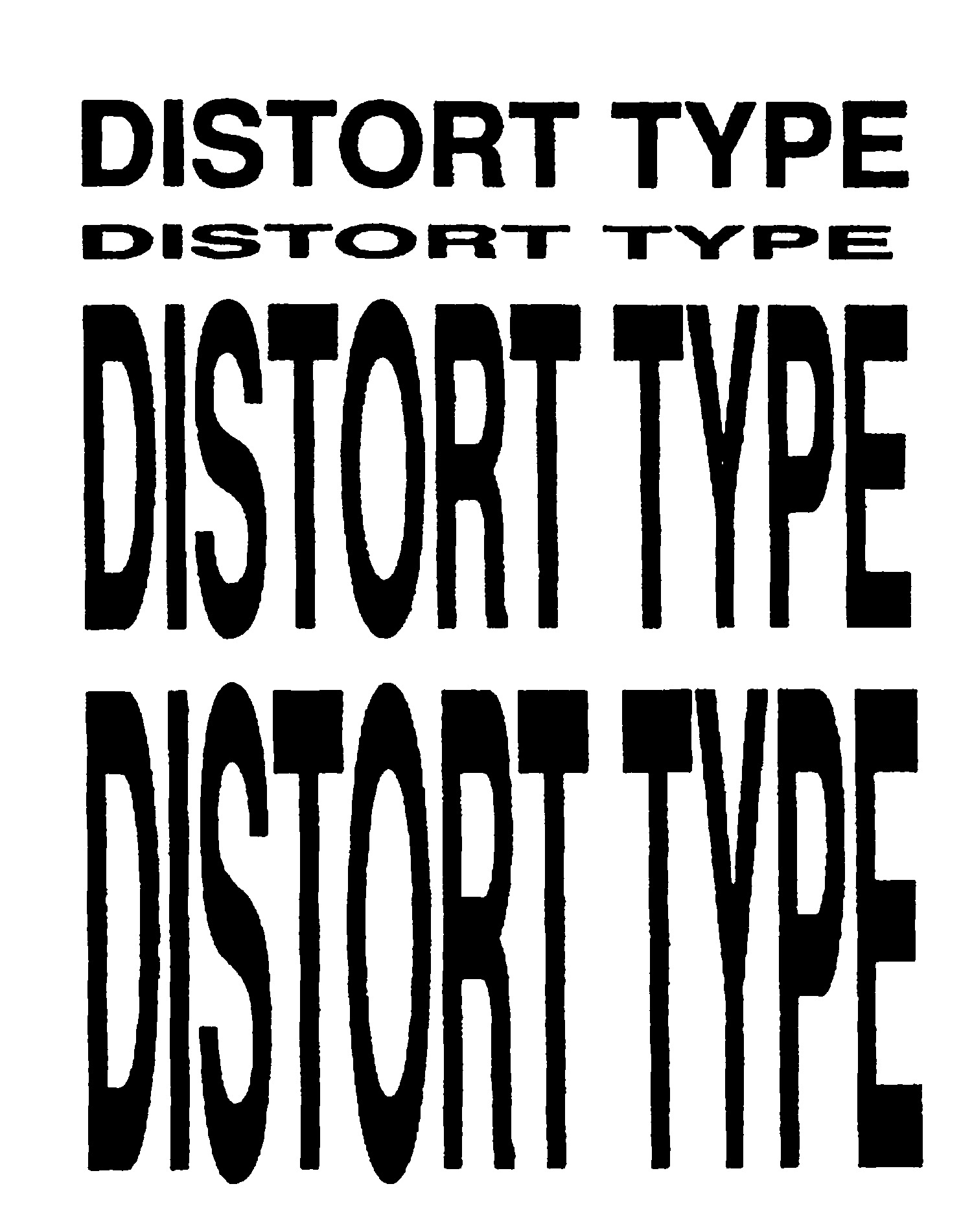
Suddenly in 1988, anyone with a Macintosh or other computer and a $495 software program could wreak havoc on these beautifully crafted forms. Consider the four versions of Helvetica Medium, executed on a computer and outputted from a Linotron 100 at 1270 dots per inch. The top setting is normal type, reasonably close to the original font created by Max Miedinger and Edouard Hoffman thirty years ago, allowing for some alteration when converted to a specific digital output device. The second version was produced by grabbing the corner of the type with the mouse and squeezing it down into a shorter version, and the lower versions were produced by grabbing the corner of the type with the mouse and stretching it into taller, condensed versions. The computer is a dumb robot, totally ignorant of the principles of perception mentioned earlier. In the lower versions, the horizontal strokes were stretched wider, while the vertical strokes maintained their original width. The result is grossly misproportioned letterforms. The optical adjustment of the O and S is exaggerated, making them seem too tall for the other letters. We are seeing typography approach this level of obscenity as students, neophytes, and even experienced designers, berserk over the new toy, violate well-drawn letterforms without bringing compensating values of expression or form to their work. Goudy and Baskerville must be spinning in their graves, and Frutiger and Miedinger must be quite depressed to see their artful letters, created as an act of love, destroyed by those who either cannot see or simply do not care.
One impact of this new graphic software relates to what is becoming known as Deconstructivist typography, whose integrated whole is taken apart. While some of the practitioners of this new typographic movement exhibit great sensitivity and originality, others are merely flitting through the collection of graphic procedures available with the new software. . . . Operations that formerly required painstaking cut-and-paste work, such as setting type in an oval or along a curved baseline, can now be performed instantly by drawing an oval, a circle or a meandering line, typing in the text, then clicking the mouse on the word “Join” in the menu. The oval, circle, or line instantly becomes the baseline of the type. These graphic devices provide a vocabulary of instant clichés, executed as simply as snapping one’s fingers. Often, these techniques are used, not for thoughtful communicative or expressive reasons, but simple because they are there. The problem for designers exploring the elastic typography and/or the Deconstructivist sensibility on a computer is, “What do you do for an encore?” As with most specialized tools, a computer-graphics program permits one to do a limited number of things very efficiently, but only operates within a fixed range of possibilities. Its innovative graphic techniques will become old and tired very rapidly as more and more people hop on the bandwagon, transforming graphics that originally appeared fresh and innovative into hack work.
Another problem with all this graphic power is that tremendous capability is put into the hands of people who don’t know an ampersand from a hole in the ground. A newsletter recently crossed my desk with each column of type linespaced differently, because the novice desktop publisher discovered that the page-layout program would permit automatic leading to fit the column depth. Columns in 10-point Times Roman with no leading were adjacent to other columns set in 10-point Times Roman with about 25 points of leading between the lines. Text columns were justified, producing gaping holes in each line of type due to poor wordspacing. He or she was too naive about typography to realize how the inconsistent wordspacing destroyed legibility and the tonal quality of the page.
Although equipment manufacturers and software developers have made modest efforts to educate their users about the rudiments of design through little booklets explaining effective page layout or newsletter design, complete with case studies of redesigned publications with notable improvements, a new generation of unschooled graphic designers—editors, public-relations agents, secretaries, and other do-it-yourself desktop publishers—are totally ignorant of the rudiments of publication design and typography. Adobe, the company that developed the PostScript software that transforms crude bitmapped type on the computer screen into refined high-resolution output, publishes excellent materials. Some software tutorials address design issues, but do it poorly. More must be done. There should be an ethical responsibility on the part of companies that put powerful tools into the hands of uninformed people without educating them about the proper use of these tools.
The obscene typography machine can also be the sublime typography machine. Professional designers can explore new creative possibilities and spend more time developing concepts and designing and less time laboriously executing their work. As this technology becomes available in third-world nations, their efforts toward education and development can take quantum leaps forward as a result of the economy of desktop publishing. The computer-graphics force is now with us, but its dark side must be controlled; otherwise, the obscene typography machine is going to inflict unimagined graphic atrocities upon the public.
From Print 43, no. 5 (September/October 1989).