By participating in this section you will be able to:
-
Explain why statistics is so important
-
Appreciate the power of statistics through examples
-
Describe the difference between descriptive and inferential statistics
Professor Weaver’s Take
Statistics can be very disorienting because of the jargon and necessarily scaffold nature of the techniques. For example, an advanced statistics textbook may read: “hierarchical linear models, or mixed models, allow for the incorporation of both fixed and random effects at multiple levels of analysis by generalizing linear and other forms of regression.” If that was a fully intelligible sentence, this course will be a review for you. However, if that statement caused your head to spin or at least caused you a pause, this course will provide some of the framework for those concepts. In this section, I’ll introduce you to the basic concept of statistical analysis and a few techniques to get you started.
Like Lao Tzu wrote in the Tao Te Ching: “a journey of a thousand miles starts beneath one’s feet,” we must get started here before we can get anywhere. Let’s take the first few steps now.
Why Statistics?
You are likely asking “why should I take statistics?” You may have decided to take this course because it is required by your major, because it fulfills a general education requirement, and / or because it fits your schedule. These are all practical reasons to take this course, but I hope that you will (by the end of the course) realize that statistics is the most fabulously interesting and worthwhile use of your time. Well maybe not the most fabulous thing that you can do but you will find, if you take the time to learn the basics and appreciate the applications, that understanding statistics will pay dividends in how you understand the world and make your decisions.
So, why does the world need statistics? Why has this field become so important to our society? Why do actuaries make a median salary of $100,610 as of 2016 (“Actuaries: Occupational Outlook Handbook: U.S. Bureau of Labor Statistics,” 2017)? Statistics is a tool that can be used by anyone who wants to understand patterns, make predictions, and thus make better decisions. Even you can use data, recognize patterns, and make predictions in your own life.
Median: the value that is above (larger than) half of the other values.
The Power of Statistics
Let’s start with a timely example. Imagine that you run an insurance company, the goal of which is to provide enough coverage that your clients are willing to continue to pay premiums but to ensure that you aren’t paying more than you’re taking in. In fact, your goal is to make as much money as is sustainable. What would you consider when selecting your clients? What would you consider in selecting your providers? What trends in the political culture might influence your decisions? These seem like complex questions and relationships. They certainly are. However, those who understand probability and statistics can examine the influence of these characteristics on outcomes such as revenue, client wellness, and fiscal stability.
On a smaller scale, you might consider a restaurateur who is thinking about what meals to serve and what ingredients to purchase for summer, which tends to be a busy period for tourism. Rather than simply choosing dishes that he or she likes, the restaurateur examines sales of meals from the busy seasons of the last few years to find that there are several that were big sellers and those that were not. Knowing this, the restaurateur can make a better prediction of what will sell and thus what ingredients to buy. Hopefully, these predictions will lower the likelihood of wasting food and money.
Alright, I get it. You aren’t the CEO of a major insurance company or the owner of a hip restaurant. You’re likely someone who has to worry about when to leave to get to work on time or what classes you should take to best prepare for your career. How can statistics help you? Just because you are not managing a section of a billion dollar industry or earning a Michelin Star for your take on grilled cheese doesn’t mean that you shouldn’t use data to improve your decisions and thus your life.
We’ll start with analyzing a commute. You noticed that on some days you get to work 30 minutes too soon and other days you arrive 5 minutes too late. Worst yet, you don’t seem to know which days are which. On top of the frustration of unpredictable traffic, your boss is taking note and tells you that you cannot be late again…or else! You have two options. The first is to leave your house so that you are sure you will always be there before your shift starts but that means you may be waiting around for 45 minutes. The second option is to figure out which conditions lead to more and slower traffic.
I think you know my preference and I think that the second option should be your preference, too. Not just because statistics is fun (I’m getting excited thinking about all the figures and charts right now!) but because statistics empowers you. By understanding the traffic patterns and the factors that influence them, you can have an extra 30 minutes sleep; how glorious! So, what can you do to find those days that allow you to get more sleep?
General Steps in Statistical Analysis
-
GET SOME DATA. Data can come in many forms because data is information. In this case, your data on traffic information can come from your own observations. In many cases, you can find other data that is publicly available.
-
MAP OUT THE DATA. When trying to understand how something works or why certain things happen, you need to get an in depth look at the parts and how they relate. You need to do the same in statistics. To understand a pattern, you need to see the pattern at work. You need to visualize the moving pieces to see how those pieces are interconnected. Data visualization is a key component of statistical analyses because the human brain is a visual pattern analyzer. By mapping out your data, you are making what may be invisible in your everyday experience visible through organization. In this example, a bar chart may serve you well.
-
SUMMARIZE THE DATA. Patterns are often difficult to detect because the data are not organized or there is too much data for someone to take in all at once. When we summarize the data, we are concentrating the pattern into a form that we can comprehend. For the traffic patterns example, we may start by calculating some means.
-
MAKE A CONCLUSION. This last step is the most important because we take all of those summaries of our data and decide what it means. We decide if our summary or pattern is reliable. That is, we decide if we are likely to see that same pattern in other similar situations. If we decide that our findings from our analysis of traffic patterns is reliable, we can use it to guide our decisions about when to leave the house in the future.
Example
Now that we know these general steps, let’s walk through the example with some details.
Get some data: You decide to track the duration of your commute each day, the weather (raining, or not raining), the day of the week, and whether the elementary school is in session. After 14 days you get the following table of data
Table 1.1
Factors Influencing Commute Duration
| Day of Week | Weather | School in Session | Commute Duration (mins) |
|---|---|---|---|
| Monday | Rain | Yes | 40 |
| Tuesday | Rain | Yes | 37 |
| Wendesday | No Rain | Yes | 30 |
| Thursday | No Rain | Yes | 32 |
| Friday | No Rain | No | 26 |
| Saturday | Rain | No | 28 |
| Sunday | No Rain | No | 25 |
| Monday | No Rain | No | 26 |
| Tuesday | No Rain | Yes | 31 |
| Wendesday | Rain | Yes | 38 |
| Thursday | Rain | Yes | 37 |
| Friday | Rain | Yes | 35 |
| Saturday | No Rain | No | 22 |
| Sunday | Rain | No | 27 |
It may be difficult to discern any particular pattern just by looking at a table of numbers. Let’s transform this table into something a little more organized and a little easier to understand.
Map out the data: There are a lot of different ways that we can represent this information. One factor
that seems to have a straightforward pattern is day of the week. Let’s graph duration across day of the week.
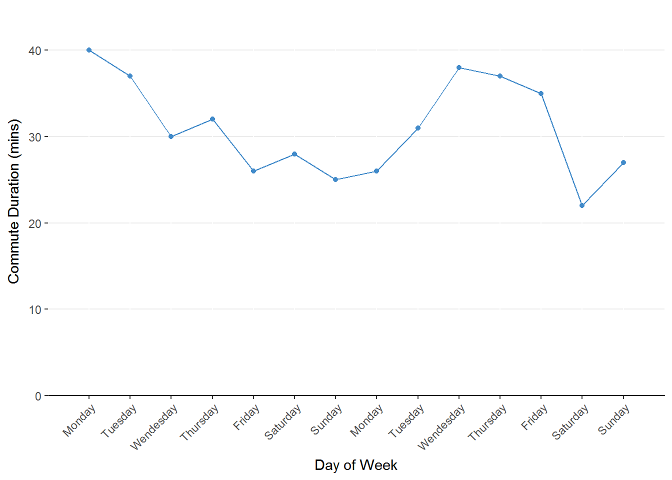
Figure 1.1. Line chart representing the change in commute duration across days of the week. The predictor (days of the week) is on the x-axis and the outcome (commute duration) is on the y-axis.
Although this is a nice figure, it doesn’t yield a definitive conclusion. It seems that the commute is shorter
on the weekend than during the week but there is still a lot of uncertainty. We still have two factors to examine
so we will map duration onto whether or not school is in session next.
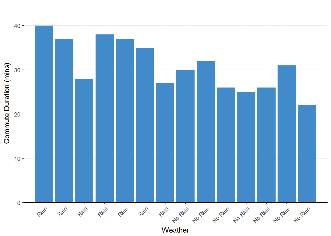
Figure 1.2. Bar chart representing the change in commute duration due to weather. The height of the bars represents the duration for each observation.
Once again we are left with some hints but not a full story. It seems that the commute tends to be longer when
it rains compared to when there is no rain but there is still a lot of variability. What about school traffic?
Does that impact your compute time? Let’s take a look at that graph.
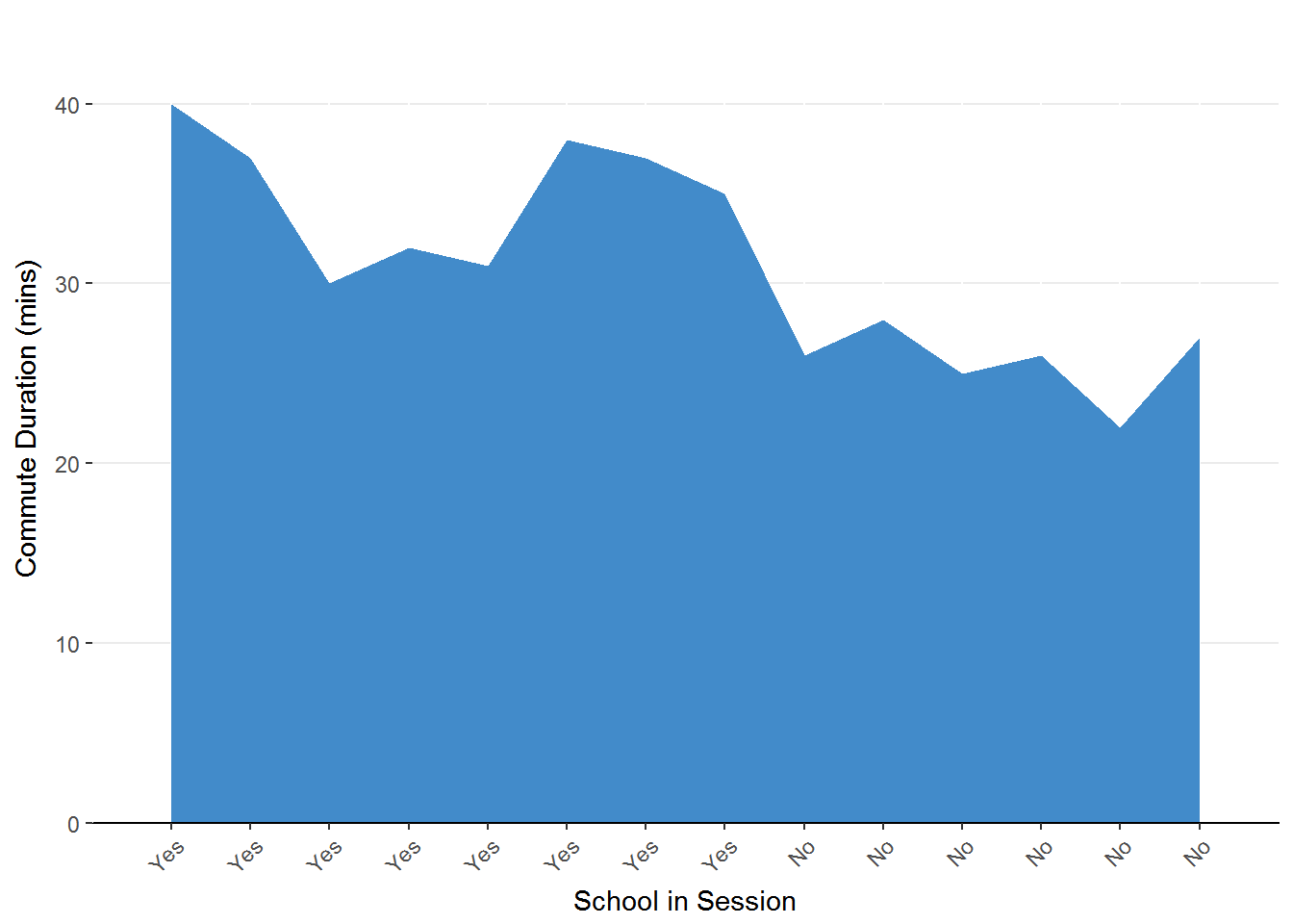
Figure 1.3. Area chart representing the change in commute duration as a factor of school session. The predictor (school in session) is on the x-axis and the outcome (commute duration) is on the y-axis.
This graph seems to indicate that your commute is longer when school is in session. The commutes during school days are each longer than the days in which school is not in session. Of course, there is still some differences in each group.
In all three figures we gain some insight into the effect of day of the week, weather, and school being in session on commute duration. These charts have some issues in that there are multiple, repeating, points for day of the week, for weather, and for school in session. Perhaps we could get a better understanding of these factors if we were to summarize these repeating points.
Summarize the data: To summarize is to combine and simplify. This is very important for data sets that have more than a few data. How might we summarize our data to reduce the repeating factors? One option (that is often utilized in statistics) is to take the average commute duration for those repeated values of our factors. By average, I am referring to calculating the mean in which we add a set of numbers and then divide by how many numbers we added.
Let’s calculate the mean commute duration for the two Mondays from our data set.
Mean: the value that is at the balancing point for the data
\[ \text{Mean Monday Commute} = \frac{\text{Monday 1 Commute + Monday 2 Commute}}{\text{Number of Monday Commutes}}=\frac{26+40}{2}=33 \]
You could tell someone that it takes an average of 33 minutes to get to work on Mondays.
Before going any further, let’s make sure that your arithmetic skills are ready for statistics. Although statistics is a sophisticated tool, you really only need the ability to follow order of operations (i.e, PEMDAS) and to be able to work with fractions.
PEMDAS: Parentheses, Exponents, Multiply, Divide, Add, Subtract