Here is a table of means for our different levels (that is to say different values) of our factors.
Table 1.2
Average Commute Time for Levels of Factors
| Factor | Level | Mean |
|---|---|---|
| Day | Monday | 33.00 |
| Tuesday | 34.00 | |
| Wendesday | 34.00 | |
| Thursday | 34.50 | |
| Friday | 30.50 | |
| Saturday | 25.00 | |
| Sunday | 26.00 | |
| Weather | No Rain | 27.43 |
| Rain | 34.57 | |
| School | No | 25.67 |
| Yes | 35.00 |
Now we can update our graphs to reflect these means rather than the individual values.
Here is the side-by-side comparison of our first attempt and our new-and-improved graph of the effect day of the week on commute duration.
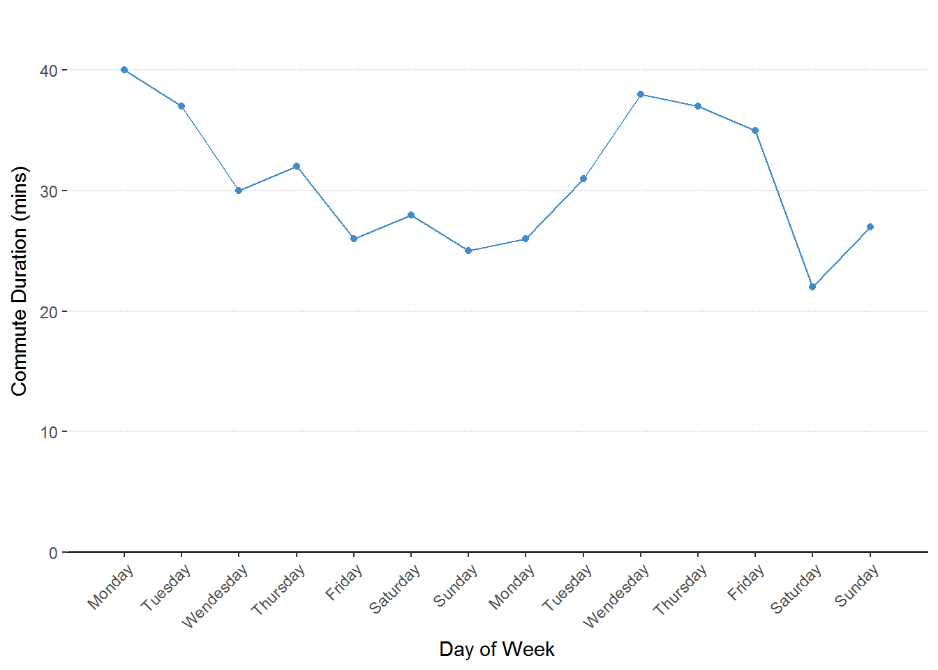
Figure 1.1. Line chart representing the change in commute duration across days of the week. The predictor (days of the week) is on the x-axis and the outcome (commute duration) is on the y-axis.
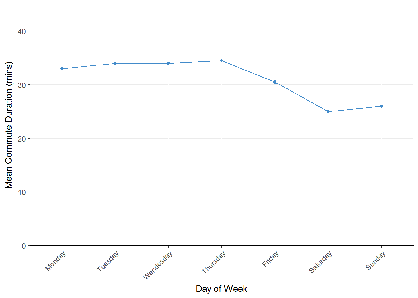
Figure 1.4. Line chart representing average commute duration by day of the week. Notice the clearer pattern emerging to figure 1.1
Now that we’ve combined the repeated days to represent the mean commute duration, the pattern of longer commute times during the week compared to the weekend becomes more apparent.
Let’s look at the old and new graphs for the effect of rain.
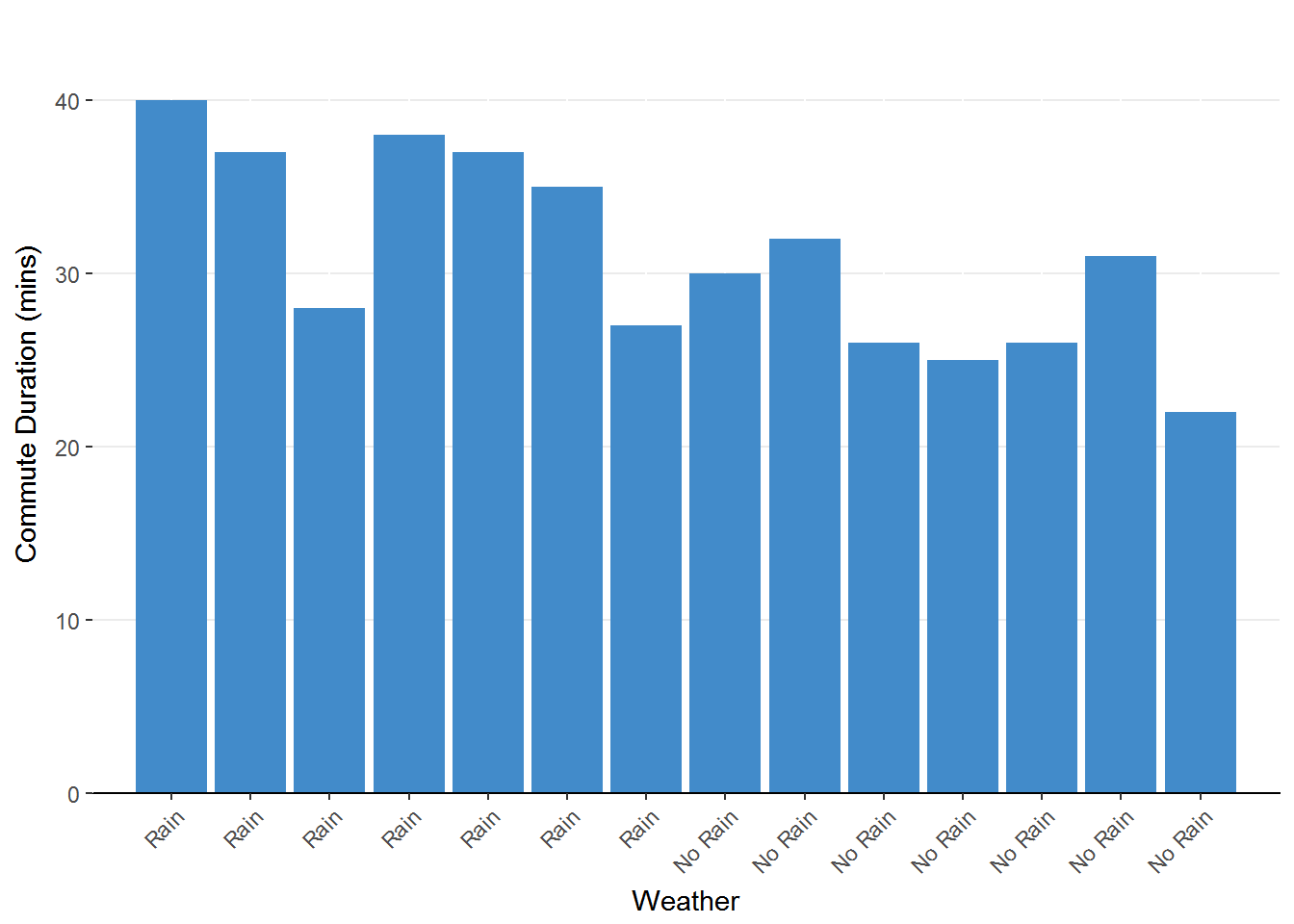
Figure 1.2. Bar chart representing the change in commute duration due to weather. The height of the bars represents the duration for each observation.
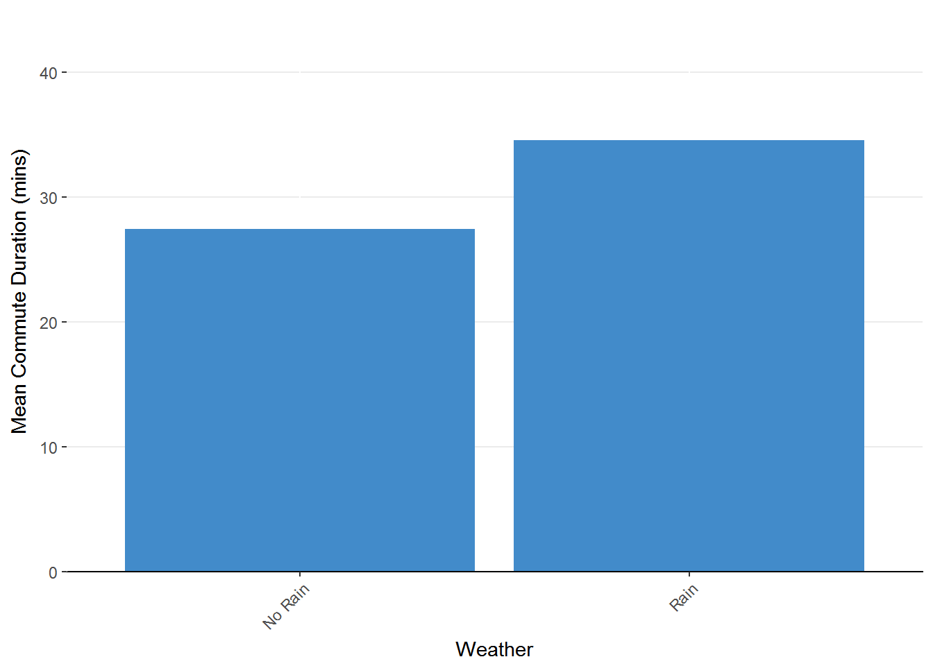
Figure 1.5 Bar chart representing mean commute duration as a factor of weather. This chart only has two bars compared to the 14 in Figure 1.2.
This pattern is very clear now that we’ve reduced the amount of visual information in the graph. That is not to say that this is an information-poor graph. We just need to remember that each bar is the result of combining multiple observations.
Lastly we can assess the the average effect of school in session on commute duration.
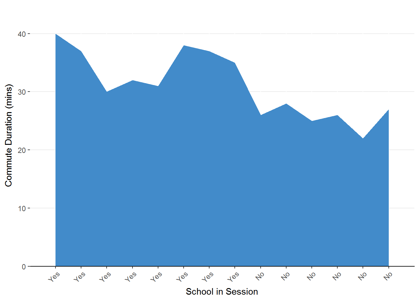
Figure 1.3. Area chart representing the change in commute duration as a factor of school session. The predictor (school in session) is on the x-axis and the outcome (commute duration) is on the y-axis.
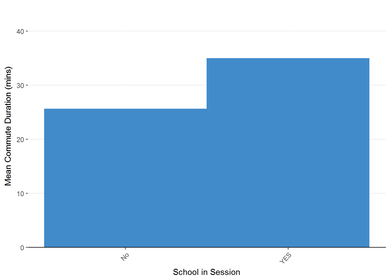
Figure 1.6 Stepped area chart representing the effect of school in session on mean commute time.
Once again we find that by summarizing values, we can make the pattern more clear. Taking stock, it seems that our commute will be longer during the week compared to the weekend, it will be longer when it rains compared to when it does not rain, and it will be longer when school is in session compared to not in session.
Make a conclusion: The last step in our analysis is to make a conclusion. That is, we need to decide if our analyses have given us some reliable results. Although this is a very important step, we don’t yet have the tools for proper conclusion making. So far, we’ve been talking about descriptive statistics but we need some inferential statistics to be able to decide if the pattern of results is appropriate for any week, not just the weeks you observed.
Two Branches of Statistics
In our working example, the summarizing of our fourteen days of observations falls into the category of descriptive statistics. Descriptive statistics describe the data that you have. There are many summaries that we can offer for our data sets, which will be introduced in the next unit.
As I mentioned earlier, we often want to make a conclusion that is appropriate for any observations we may make. That is, would our summary be representative of another span of fourteen days? To accomplish this, we need to use inferential statistics, which is the process of inferring patterns in a population based on a sample. The leap from describing the data that you have to making guesses about the data you don’t have requires some logic and some assumptions that will be covered in the second unit.
Section Review
-
Statistics is a tool set that can help us understand patterns, make predictions, and make better decisions.
-
Statistical analysis involves: get some data, map out the data, summarize the data, and make a conclusion.
-
The mean and median are summaries of data.
-
The median is the value above (larger than) half of the other values.
-
The mean is the balancing point for the data.
-
-
Although advanced statistics can involve advanced mathematics, you will be able to calculate the statistics in this course using basic arithmetic and following the order of operations (PEMDAS).
Review Questions
-
What benefits do statistics offer for anyone who wishes to use them?
-
What are the general steps in statistical analysis?
-
What is the correct order in which to carry out arithmetic operations?
-
Why is summarization important for finding patterns in data?
Where We’re Going
You’ve got the general outline of statistical analyses in place. Now it is time to build upon these to appreciate the value of summarization and generalization.
The rest of this course is divided into three units.
- Unit 1: Describing data offers some important language to describe data as well as techniques used to summarize important information from data sets
- Unit 2: Generalizing to populations provides information on how to utilize probability, distributions, and descriptive statistics to make educated guesses about population patterns.
- Unit 3: Tests of significance is a collection of procedures to be used to test if certain patterns exist in the population including differences in means and relationships.
As you go forward, remember that statistics is a decision-making tool and as with the mastery of any tool, it will take some time, some effort, and some missteps. These discomforts are temporary, however, with a wealth of opportunity for understanding as their reward.
Try your hand at a few homework problems by clicking on the “next”" button below. After submitting your work and checking your answers, you can take the section quiz. These quizzes can help you identify gaps in your understanding an offer you some steps to fill those gaps before moving on.
A course in statistics is inherently cumulative (that is, you will always need to use the information you have learned in the beginning throughout the course) so it is very important to make sure you understand early concepts before venturing into more advanced content.
Click the “next” button below to access the homework
References:
Actuaries: Occupational Outlook Handbook: U.S. Bureau of Labor Statistics. (2017, October 21).
Retrieved October 21, 2017, from https://www.bls.gov/ooh/math/actuaries.htm