By completing this section, you will be able to:
Describe the information contained in frequency distributions
Identify the components of a frequency distribution
Construct a simple frequency distribution for ungrouped data
Construct a simple frequency distribution for grouped data
Construct a cumulative frequency distribution
Construct a relative frequency distribution
Construct a percent frequency distribution
Construct a cumulative percentage frequency distribution
Determine percentile points in a distribution
Match charts to frequency distributions
Professor Weaver’s Take
The role of statistics in science is two-fold: description and estimation. Science heavily relies on statistical techniques to come up with an estimate for the strength of some effect or relationship between variables in a population but these techniques are all based in the description of a sample. This means that we will have to learn how to properly describe our sample dataset before we can attempt to generalize to a population. We will start with frequency distributions.
What Is a Frequency Distribution
Although the term may seem foreign, you have likely encountered many frequency distributions throughout your life. When you were growing up, your pediatrician likely said something along the lines of “Her growth is good! She is in the 52nd percentile for height and the 50th percentile for growth.” Or perhaps you recently read a poll which suggested that 69% of Americans believe that global warming is happening and 14% do not (Howe, Mildenberger, Marlon & Leiserowitz, 2015). Perhaps you saw a pie chart that indicated the number of individuals who prefer Pepsi, Coca-cola, and Dr. Pepper.
Table 5.1
Simple Frequency Distribution of Soda Preference
| Soda | Frequency |
|---|---|
| Coca-Cola | 82 |
| Pepsi | 75 |
| Dr. Pepper | 36 |
| Total | 1932 |
These examples help to illustrate that frequency distributions are just summaries of how many observations fall into each category of or range of values in a variable. They can be expressed as a simple count or total number of observations or as percentage of observations, or even as the percentage of observations below a value. Typically, frequency distributions are reported in a table with one column representing the categories or ranges of values for the variable and another column representing the number of observations for those categories/value ranges. In all cases, frequency distributions help to summarize and make comparisons across categories or values of your variables.
Now that there are some concrete examples and a little ground work on the concept, let us break down the terminology. A distribution is the complete set of observations for a variable, organized by the categories or values of that variable. When we add information about frequency, we are simply indicating how often an observation falls within range of values or category of the variable.
Frequency Distribution: A summarization of the number of observations that fall within a category or range of values for a variable.
Variations of Frequency Distributions
Remember that all frequency distributions express how many observations fit into a category or range of values for a variable. However, it can be useful to reframe that information to better make comparisons across the data. We will discuss the benefits of and then construct each of the following: simple frequency distributions (for both ungrouped and grouped data), cumulative frequency distributions, relative frequency distributions, percent frequency distributions, and cumulative percent distributions. It may seem like a long list, but there are only a few mathematical operations that separate the whole lot.
Simple Frequency Distributions
The simple frequency distribution is so named because it only involves counting the observations for each category or range of values. There are sub-classifications for frequency distributions based on how we represent the values of the variable. If the values of the variable are few (e.g., ten or so) or if the values of the variable are categories, we will simply count the observations per category or value. That is, if the variable is categorical or discrete with a few values, then we will construct the simple frequency distribution for ungrouped data.
Ungrouped Data: Organizing discrete variables with a few values or categorical variables without combining across values.
However, if we have a variable that has many possible values (e.g., a quantitative, continuous variable), we will need to reduce the amount of values by creating groups. We will work through the process of creating groups for a simple frequency distribution for grouped data in a subsequent section.
Simple Frequency Distribution for Ungrouped Data
To work through the creation of a simple frequency distribution for ungrouped data, let us imagine that we asked 15 students on which night of the week to they get the most sleep? The results are in table 5.2.
Table 5.2
Night of Week for Most Sleep
| Student | Weeknight | Student | Weeknight | Student | Weeknight |
|---|---|---|---|---|---|
| 1 | Sunday | 6 | Wednesday | 11 | Thursday |
| 2 | Monday | 7 | Sunday | 12 | Sunday |
| 3 | Thursday | 8 | Saturday | 13 | Wednesday |
| 4 | Sunday | 9 | Monday | 14 | Saturday |
| 5 | Tuesday | 10 | Tuesday | 15 | Sunday |
Even with this small dataset, it is difficult to judge the night during which most students in our sample get the most sleep. We can create a simple frequency distribution to better summarize this dataset.
STEP 1: List your variable values (in order if possible)
Our variable is night of the week so we will include all seven days of the week
Table 5.3
List of Weeknights
| Weeknight |
|---|
| Sunday |
| Monday |
| Tuesday |
| Wednesday |
| Thursday |
| Friday |
| Saturday |
STEP 2: Count the observations for each value
Now that we have our categories set, we can count how often each appears in our dataset. I recommend a quickly tally mark next to the category followed by striking out that observation in your original dataset.
Here is what our table would look like after the first five observations
Table 5.4
Striking Out Night of Week for Most Sleep
| Student | Weeknight | Student | Weeknight | Student | Weeknight |
|---|---|---|---|---|---|
| 1 | 6 | Wednesday | 11 | Thursday | |
| 2 | 7 | Sunday | 12 | Sunday | |
| 3 | 8 | Saturday | 13 | Wednesday | |
| 4 | 9 | Monday | 14 | Saturday | |
| 5 | 10 | Tuesday | 15 | Sunday |
Table 5.5
Tally of Weeknights
| Weeknight | |
|---|---|
| Sunday | | | |
| Monday | | |
| Tuesday | | |
| Wednesday | |
| Thursday | | |
| Friday | |
| Saturday |
After you go through the whole dataset, you will need to convert your tallies into numerals and then add those numbers as an extra column labeled “Frequency.” If you prefer to skip the tally step, you can just count the number of observations matching each category.
STEP 3: Count the Total Number of Observations
After counting all the observations per category, add up all the rows in your table and record that total in a new row labeled “Total”. This is an important final step to ensure that all the observations in the dataset are included in your frequency distribution.
Table 5.6 displays the finished simple frequency distribution for ungrouped data.
Table 5.6
Simple Frequency Distribution for Ungrouped Data Representing the Weeknight with Most Sleep
| Weeknight | Frequency |
|---|---|
| Sunday | 5 |
| Monday | 2 |
| Tuesday | 2 |
| Wednesday | 2 |
| Thursday | 2 |
| Friday | 0 |
| Saturday | 2 |
After having completed the simple frequency distribution, we can easily judge on which night students report getting the most sleep (Sunday). In the same table, we can also judge the weeknight least reported for most sleep (Friday). As a visual alternative, we can construct a bar chart. A bar chart has the categories or values along the x-axis and the count or frequency of observations in each category along the y-axis. The height of the bars thus indicates the frequency of each category. A bar chart for our data is represented in Figure 5.1
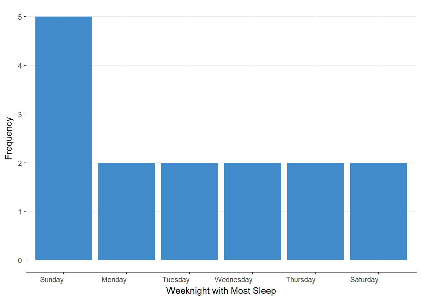
Figure 5.1. Bar chart representing simple frequency distribution for ungrouped data.
Simple Frequency Distribution for Grouped Data
Grouped Data: Organizing continuous variable values into groups or bins for summarization of values.
Let’s update our example to include a more precise measure of sleep across the week. Rather than asking students on which night of the week they got the most sleep, we’ll imagine that we asked each student the longest they slept during the week in hours (rounding to the nearest half hour). The data are shown in table 5.7.
Table 5.7
Maximum Hours Slept| Student | Hours | Student | Hours | Student | Hours |
|---|---|---|---|---|---|
| 1 | 8 | 6 | 7 | 11 | 8 |
| 2 | 7.5 | 7 | 6.5 | 12 | 10 |
| 3 | 9 | 8 | 9.5 | 13 | 5.5 |
| 4 | 8.5 | 9 | 5.5 | 14 | 7.5 |
| 5 | 6 | 10 | 6.5 | 15 | 8.5 |
Whereas “night of the week” was a categorical variable (assessed on the nominal scale of measurement), maximum hours slept is a continuous variable (assessed on the ratio scale of measurement). This means that the values between the whole numbers are meaningful and that there are not gaps in between our values. We have two options for creating a frequency distribution for this data. The first is option is to use each unique value in the dataset as its own group. If we scan through our data, we will find that there are 11 unique values. Although this is a manageable number of categories, it does not offer much of a summary of our data. The second option, to create groups or bins, would allow us to make a more manageable list with more summarizing.
Bin: the group or range of values created for continuous variables.
The process for creating a simple frequency distribution for grouped data is the same as it was for the simple frequency distribution for ungrouped data with one exception. We must first create our bins before we can count how many values fit within each bin.
STEP ONE: Determine the Inclusive Range of the Data
The inclusive range (or the real range) of the data is the amount by which the maximum value is larger than the minimum value, plus one. By subtracting the minimum from the maximum, we get the simple range. By adding one to that result, we are accounting for maximum and minimum rather than just the values in between.
Inclusive Range (real range): the difference between the maximum and minimum values plus one.
The maximum value in our dataset is 10 and the minimum value is 5.5. Our inclusive range is thus 10 - 5.5 + 1 = 5.5
Our next step is to evenly divide this inclusive range into our bins.
STEP TWO: Decide the Number of Bins
There are not hard rules on the proper number of bins into which you should divide your range. My suggestion is that you should choose a number that offers some amount of summarization (i.e., less than the number of unique values in the dataset) but does not reduce the amount of information greatly (i.e,, more than three bins). In our example, I believe that 4 bins will serve us nicely.
Check out the impact of the number of bins on distribution shape by selecting a number on the slider below
STEP THREE: Calculate the Interval Width
Now that we know the span of our data (the inclusive range) and the number of bins into which we wish to divide the data, we can calculate the interval width. The calculation is straightforward; divide the inclusive range by the number of bins.
Interval width: the range of values to be included in each bin.
For our example, the interval width is
\[ \text{Interval Width} = \frac{\text{Inclusive Range}}{\text{Number of Bins}} = \frac{5.5}{4} = 1.375 \]
That is, each bin should span 1.375 hours.
STEP FOUR: Determine the Bounds of Each Bin
Remember that our goal is to summarize our data for ease of interpretation. With continuous data such as we have, we cannot simply count the unique values as we are unlikely to do much summarization. Instead we will group similar values together. In this step, we will set the boundaries of what we mean by similar.
We start with the minimum value in our dataset as the lower bound of our first bin. To get the upper bound of that first bin, we simple add the interval width the lower bound. Here are the steps
Lower bound = minimum value = 5.5
Upper bound = lower bound + interval width = \(5.5 + 1.375 = 6.875\)
As such, the bounds for our first bin are [5.5, 6.875]. Note that the square brackets around our interval bounds indicate that 5.5 and 6.875 are exclusively included in this bin, which means that we will not count those values as part of any other bin.
To calculate the bounds of subsequent bins, we need only update our procedure slightly. Rather than starting with the minimum value as the lower bound, we take the next highest available value as the lower bound. Given that our first bin included 6.875, the next available value is 6.876. Once again, we will calculate the upper bound by adding to it the interval width.
Lower bound = next available value = 6.876
Upper bound = lower bound + interval width = \(6.876 + 1.375 = 8.251\)
Let us move this procedure into a table to help us keep track of the data and the steps.
Table 5.8
Finding the Bounds for Each Bin
| Bin | Lower Bound | Interval Width | Upper Bound |
|---|---|---|---|
| 1 | 5.5 | 1.375 | 5.5 + 1.375 = 6.875 |
| 2 | 6.876 | 1.375 | 8.251 |
| 3 | Next available value | 1.375 | |
| 4 |
As indicated in the table, you can simply add across the columns to get the upper bound. Then, to start the next bin, just go to the next available value for the lower bin and repeat the procedures. Table 5.9 has the complete set of bounds.
Table 5.9
Completed Table for Bin Bounds
| Bin | Lower Bound | Interval Width | Upper Bound |
|---|---|---|---|
| 1 | 5.5 | 1.375 | 6.875 |
| 2 | 6.876 | 1.375 | 8.251 |
| 3 | 8.252 | 1.375 | 9.627 |
| 4 | 9.628 | 1.375 | 11.003 |
Now that we have the bounds for all our bins, we can set up for our final step (tabulating the frequencies for each bin) by transferring this information into the first column of a frequency distribution.
Rather than a unique value, we will designate the bin by writing the bounds as [lower, upper]. Table 5.10 has the bins in a frequency distribution.
Table 5.10
Simple Frequency Distribution for Grouped Data
| Hours Slept | Frequency |
|---|---|
| [5.5, 6.875] | |
| [6.876, 8.251] | |
| [8.252, 9.627] | |
| [9.628, 11.003] | |
| Total |
As you can see in table 5.10, all of the possible values in our data set will fall somewhere between the lower bound of the first. The last step is to count how many observations fit into each bin.
STEP FIVE: Count the Observations for Each Bin
Just as we had done for the simple frequency distribution for ungrouped data, we can create do the tally-and-cross method. That is, we go through the original dataset to decide into which bin each observation fits then cross out that observation. Table 5.11 and 5.12 demonsTable this process for the first seven observations.
Table 5.11
Crossing out assigned observations
| Student | Hours | Student | Hours | Student | Hours |
|---|---|---|---|---|---|
| 1 | 6 | 11 | 8 | ||
| 2 | 7 | 12 | 10 | ||
| 3 | 8 | 9.5 | 13 | 5.5 | |
| 4 | ~~8.5 | 9 | 5.5 | 14 | 7.5 |
| 5 | 10 | 6.5 | 15 | 8.5 |
Table 5.12
Tallying observations
| Hours Slept | Frequency |
|---|---|
| [5.5, 6.875] | I I |
| [6.876, 8.251] | I I I |
| [8.252, 9.627] | I I |
| [9.628, 11.003] | |
| Total |
Continue to tally-and-cross until you’ve gone through the entire dataset then convert the tallies to numerals. You should have the same frequency distribution as table 5.13
Table 5.13
Complete Simple Frequency Distribution for Grouped Data
| Hours Slept | Frequency |
|---|---|
| [5.5, 6.875] | 5 |
| [6.876, 8.251] | 5 |
| [8.252, 9.627] | 4 |
| [9.628, 11.003] | 1 |
| Total | 15 |
If you want to visualize the information in this table, you should construct a histogram. A histogram is like a bar chart but for continuous data. To represent the continuity of data, we make the bars touch. If we have grouped data, such as in our current example, you list the bounds below the bars. Figure 5.2 is a histogram for our data.
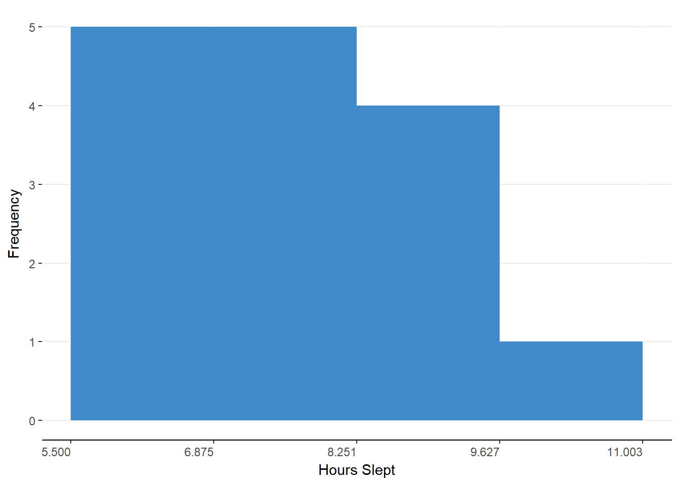
Figure 5.2. Histogram representing simple frequency distribution for grouped data.
A quick check of table or histogram indicates that there is one student getting a lot of sleep and most students getting between 5.5 and 8.25 hours of sleep. Not bad but given the students that I know, I think our sample is biased. I think that we’ve missed those students who are squeaking by with a few hours.
In Review
We can use a simple frequency distribution for grouped data when we have data that has many, ordered values. To offer more summary than would occur if we listed all the unique values, we create bins, or intervals, or values. We can then count the number of observations that fit into each bin. The steps for creating the simple frequency distribution for grouped data are listed below.
Steps for Creating a Simple Frequency Distribution for Grouped Data
Determine the inclusive range of the data
Decide the number of bins
Calculate the interval width
Determine the bounds of each bin
Count the observations for each bin
Cumulative Frequency Distributions
Now that we have the simple frequency distribution down, we can explore some variations on this setup. The first of which is the cumulative frequency distribution. The only difference with this distribution is that we will reflect how many observations are in the current bin (or match the current value if preparing a simple frequency distribution for ungrouped data) or below. Essentially, we are going to add up the number of observations as we go. Let us work through the steps using table 5.14
Table 5.14
Converting a Simple Frequency Distribution into a Cumulative Frequency Distribution
| Hours Slept | Simple Frequency | Cumulative Frequency |
|---|---|---|
| [5.5, 6.875] | 5 | = simple frequency = 5 |
| [6.876, 8.251] | 5 | = simple frequency + previous cumulative frequency = 5 + 5 = 10 |
| [8.252, 9.627] | 4 | = 4 + 10 = 14 |
| [9.628, 11.003] | 1 | = 1 + 14 = 15 |
| Total | 15 | 15 |
For the first bin, the cumulative frequency is the simple frequency because we have no values below to add to the current frequency. For each of the following bins, we simply add together the simple frequency for that bin and the cumulative frequency for the previous bin. When you get to the last bin, the cumulative frequency should be the total of the simple frequencies. Figure 5.3 shows the cumulative frequency as a histogram.
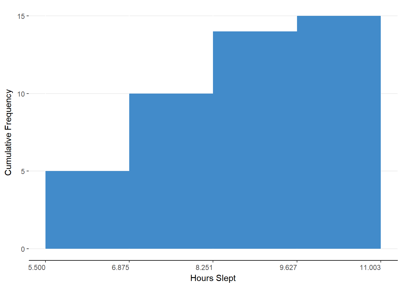
Figure 5.3. Histogram representing cumulative frequency distribution for grouped data.
This presentation of the data can highlight how much each bin of observations is contributing to the whole but we’ll see the real power of this presentation when we discuss the cumulative percent distribution.
Relative Frequency Distributions
Although looking at raw numbers allows you to appreciate the size of your sample, it is often more helpful to think about proportions. That is, we may find it more impactful if we can express the proportion of our total sample that falls within each bin. Transforming a simple frequency distribution into a relative frequency distribution requires only division. For each bin, divide simple frequency by the total number of observations in the sample. Table 5.15 shows this conversion.
Table 5.15
Converting a Simple Frequency Distribution into a Relative Frequency Distribution
| Hours Slept | Frequency | Relative Frequency |
|---|---|---|
| [5.5, 6.875] | 5 | = simple frequency ÷ total = 5 ÷ 15 = 0.333 |
| [6.876, 8.251] | 5 | = 5 ÷ 15 = 0.333 |
| [8.252, 9.627] | 4 | = 4 ÷ 15 = 0.267 |
| [9.628, 11.003] | 1 | = 1 ÷ 15 = 0.067 |
| Total | 15 | 1.00 |
It is important to remember that we are working with proportions which can only have values between 0 and 1. As such, each bin should have a relative frequency between 0 and 1.00 and your total of your relative frequencies should be 1 because we should be accounting for all the observations.
We can now quickly learn from our table that the first and second bins each accounted for one third of the observations. This can also be seen in the histogram of figure 5.4
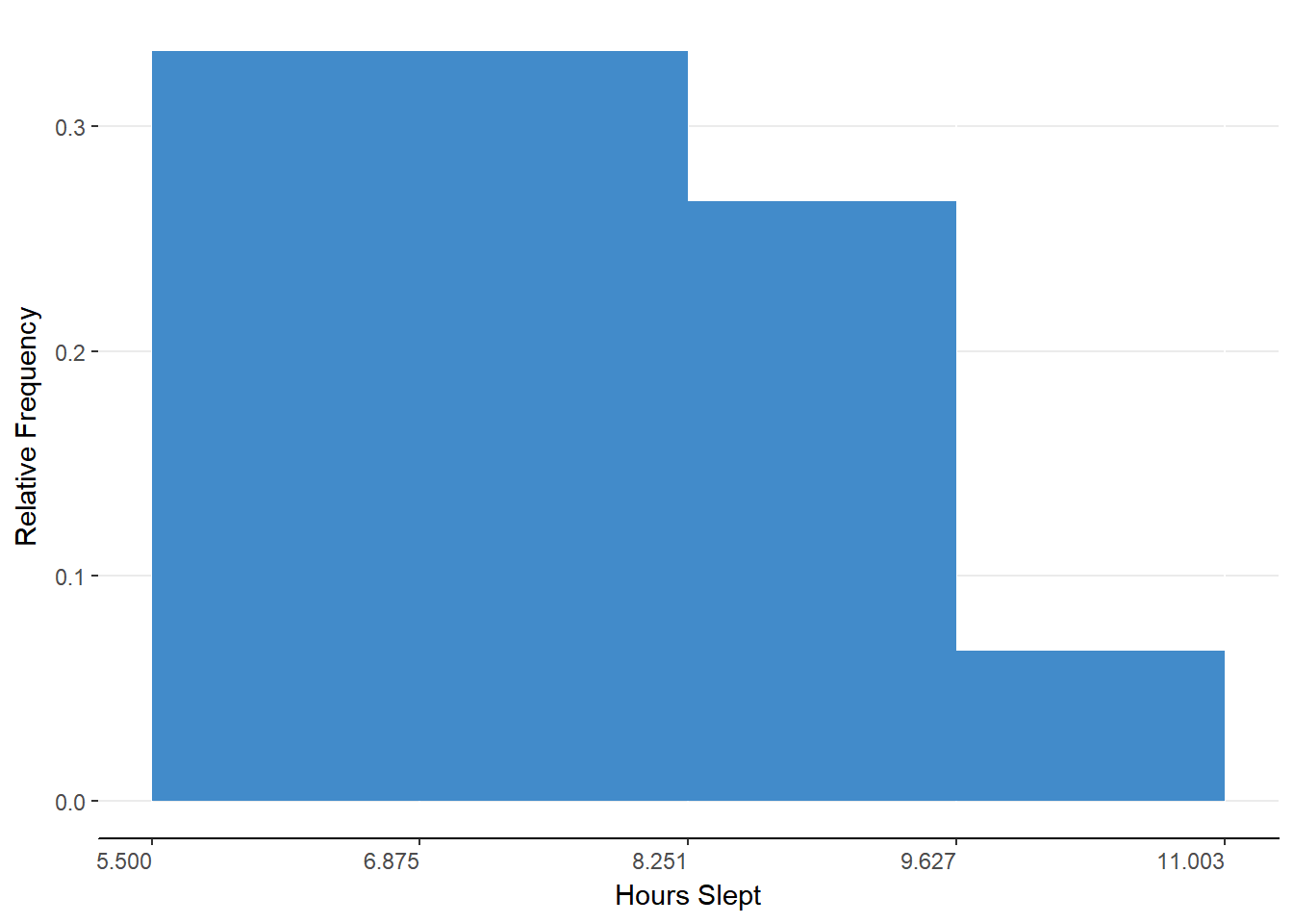
Figure 5.4. Histogram representing relative frequency distribution for grouped data.
Percent Frequency Distributions
Many find it more natural to speak about percentages rather than proportions. We can accommodate that as well with a percent frequency distribution. This is the easiest conversion yet because we need only multiply each relative frequency by 100 and add a percent sign. Table 5.16 shows this step.
Table 5.16
Converting a Relative Frequency Distribution into a Percent Frequency Distribution
| Hours Slept | Relative Frequency | Percent Frequency |
|---|---|---|
| [5.5, 6.875] | 0.333 | = 0.333 * 100 = 33.3% |
| [6.876, 8.251] | 0.333 | = 0.333 * 100 = 33.3% |
| [8.252, 9.627] | 0.267 | = 0.267 * 100 = 26.7% |
| [9.628, 11.003] | 0.067 | = 0.067 * 100 = 6.7% |
| Total | 1.00 | 100% |
As with the relative frequency, we should have a total that represents the whole sample, which is 100% for percent frequency distributions.
Apart from judging the breakdown of observations across bins, we can also judge how this sample may compare to other samples, regardless of the sample sizes. That is, we can look at our sample of 15 college students and compare that to the results of a national survey of sleep habits for college students. Perhaps our students will appear to be better sleepers because they have a higher proportion or percentage of observations in the longer sleep durations than the national survey sample.
Cumulative Percent Distributions
We’ve reached the final version of the frequency distribution, the cumulative percent distribution. As the name suggests, we will be combining techniques from the cumulative frequency distribution and the percent frequency distribution. In short, we will be adding up the percentages from each bin as we go through the table.
The payoff for all this work will be the ability to judge what proportion or percentage of observations lay above or below a certain value or bin. Let us create a cumulative percent distribution from our dataset before generalizing to other examples. Table 5.17 demonstrates the steps required.
Table 5.17
Converting a Percent Frequency Distribution to a Cumulative Percent Distribution
| Hours Slept | Percent Frequency | Cumulative Percent |
|---|---|---|
| [5.5, 6.875] | 33.3% | = 33.3% |
| [6.876, 8.251] | 33.3% | = 33.3% + 33.3% = 66.6% |
| [8.252, 9.627] | 26.7% | = 26.7% + 66.6% = 93.3% |
| [9.628, 11.003] | 6.7% | = 6.7% + 93.3% = 100% |
| Total | 100% | 100% |
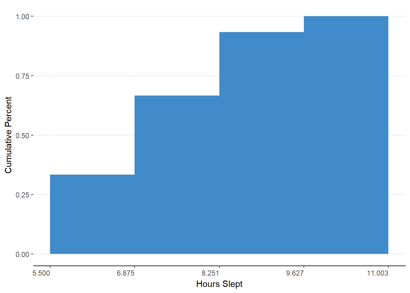
Figure 5.5. Histogram representing cumulative percent distribution for grouped data.
This table can tell us that 66.6% of our sample slept 8.251 hours or fewer. We can easily know what percentage of our sample slept longer than 8.251 by subtracting the cumulative percent for that bin (66.6%) from the total (100%). As such, we can know that 100% - 66.6% = 33.4% of our sample slept longer than 8.251 hours. What we are describing are also called percentiles.
Percentile: the percentage of observations below a given value.
You’ve encountered percentiles many times. When you took your standardized tests for admittance to college, you were likely given a statistic such as being in the 88th percentile for math. This means that 88% of test takers scored below your imaginary score. This also means that 100% - 88% = 12% of test takers scored above your imaginary score.
The power of the cumulative percent distribution lies in the ability to make such relative judgements and in the ability to find mile markers in the dataset. By mile markers, I mean values that divide the distribution into different sections. For example, we may want to know the value at which 25% of the data are below. We could find the 50% mark or even that value at which only 5% of scores are greater. These values are called percentile points.
Percentile point: the value at which a certain percentage of scores are below.
Let’s find the 25th percentile point in our data.
Finding the Percentile Point
STEP ONE: Order Observations from Smallest to Largest
Ordering the data is a very important step because the order of the values is meaningful and because we want to divide the distribution at a certain location into smaller and larger values. Here are the data from table 5.7 ordered from smallest to largest.
5.5, 5.5, 6, 6.5, 6.5, 7, 7.5, 7.5, 8, 8, 8.5, 8.5, 9, 9.5, 10
Table 5.7
Maximum Hours Slept
| Student | Hours | Student | Hours | Student | Hours |
|---|---|---|---|---|---|
| 1 | 8 | 6 | 7 | 11 | 8 |
| 2 | 7.5 | 7 | 6.5 | 12 | 10 |
| 3 | 9 | 8 | 9.5 | 13 | 5.5 |
| 4 | 8.5 | 9 | 5.5 | 14 | 7.5 |
| 5 | 6 | 10 | 6.5 | 15 | 8.5 |
STEP TWO: Multiply Number of Observations by Percent
To determine which value corresponds with a percentile, we need to find the location of that value. We have 15 observations and we want to know the value at which 25% of the observations are below so we multiply 0.25 x 15 = 3.75.
Unfortunately, we do not have anything at 3.75. Because we want a value at which 25% are below, we need to round up to the next available position (4).
STEP THREE: Locate Value
With the location of the percentile point identified, we can easily find the value by counting from the smallest value to the correct number of spaces. In our example, we should count 4 spaces.
5.5, 5.5, 6, 6.5, 6.5, 7, 7.5, 7.5, 8, 8, 8.5, 8.5, 9, 9.5, 10
We can now say that a student who slept 6.5 hours slept longer than at least 25% of others in our sample. We did include some error by rounding our location from 3.75 to 4. I said it was neccesary because there was no 3.75 location. Although this true for our sample, hours of sleep is a continuous variable so we can infer the Value at 3.75.
BONUS STEP: Estimating Percentile Points
To estimate a percentile point that is in between locations, you need to find the difference between the values at the surrounding locations. In our example, the value at location 3 is 6 and the value at location 4 is 6.5. This yields a difference of 0.5.
The next step is to multiply the difference by the decimal of the percentile point location. In our example, we would multiply \(0.5 \times 0.75 = 0.375\).
The last step is to combine our partial value with or lower location value. That is, to find the valve at 3.75 (or \(3 + 0.75\)), we need to add the value at 3 (6) with our calculated value of 0.375, which gives us a value of 6.375. Stated another way, we are finding the value that is 75% of the way between 6 and 6.5.
Grouped Data:
This can be extended to grouped data as well. Let’s update our cumulative percent frequency distribution from table 5.17 and find the percentile point for the 82nd. Table 5.18 contains two new columns which contain the lower and upper bounds of the percentiles of each bin.
Table 5.18
Bounds of Percentiles in Cumulative Percent Distribution
| Hours Slept | Cumulative Percent | Lower Bound | Upper Bound |
|---|---|---|---|
| [5.5, 6.875] | 33.3% | 0% | 33.3% |
| [6.876, 8.251] | 66.6% | 33.4% | 66.6% |
| [8.252, 9.627] | 93.3% | 66.7% | 93.3% |
| [9.628, 11.003] | 100% | 93.4% | 100% |
| Total | 100% |
lf we wish to find the percentile point corresponding to the 82nd percentile, we would know to look in the third bin because it contains all percentiles between 66.7 and 93.3. To get a better estimate of the percentile point within that range, we need to establish how far from our upper bound our percentile is. ln absolute difference, 82 is 11.3 away from 93.3. To be able to equate this to percentile points, we will need this in relative distance.
Just as we had converted raw frequency to relative frequency, we will need to divide by a total. ln this case it is the total range of percentiles for the bin. We can determine this range by subtracting the lower bound from the upper bound (i.e. \(93.3 -66.7 = 26.6\) ). Dividing 11.3 by 26.6 yields a relative distance of 0.42 or 42%. This means that our desired percentile is 42% of our bin below the upper bound.
The last step is to find the number of hours slept that is 42% of the bin below the upper bound. We’ll be working backward from the previous steps to get the value. That means we will need the interval width of the bin. If you recall, the interval width we calculated earlier is 1.375. Forty-two percent of the interval is \(0.42 \times 1.375 = 0.5775\). We simply subtract this value from our upper bound to find the infered value at the 82nd percentile: \(9.627 - 0.5775 = 9.0495\).
Steps for Finding the Percentile Point
Order Observations from Smallest to Largest
Multiply Number of Observations by Percent
Locate Value
Bonus: Estimate Percentile Point
Find difference between closest values
Multiply difference by decimal of location
Combine lower location value with partial value
Grouped data:
Locate bin that contains percentile
Find distance between upper bound and percentile
Convert to relative distance (\(\frac{\text{Upper Bound - Percentile}}{\text{Percent Bin Width}}\))
iV. Multiply relative distance by interval width
- Subtract partial distance from upper bound of interval
Section Review
A frequency distribution summarizes the observed values of a variable. This summarization helps to make clear the prominment or common values in a dataset and the relative counts of all the values. Frequency distributions can be created for both grouped and ungrouped data (e.g., for continuous and discrete variables).
The presentation of the information can be:
- simple (i.e., count),
- relative (i.e., proportion of total),
- percent, cumulative (additional count for each value) and
- cumulative percent.
The various presentation formats are used to emphasize different aspects of the distribution. For example, the cumulative percent distribution can help identify the percentiles for the distribution.
Frequency distributions can also be represented graphically as bar charts for discrete variables and histograms for continuous variables.
Where We’re Going
Summarizing the a dataset by counting the number of observations for each value can improve one’s ability to identify patterns (e.g.,the most commonly occuring value). We can more completely and succinctly summarize a distribution of values by not only identifying commonality but by also representing difference. In the next section we’ll be discussing how to calculate various measures of the center of the distribution as well as how to assess the variability of the data.
Click “Next” below to see the homework problems for this section. You should complete and submit the homework before attempting the section quiz.
References
Howe, P. D., Mildenberger, M., Marlon, J. R., and Leiserowitz, A. (2015). “Geographic variation in opinions on climate change at state and local scales in the USA.” Nature Climate Change, doi:10.1038/nclimate2583