Analysis of Variance (ANOVA)
Analysis of Variance (ANOVA)Generalizing Beyond T-TestsThe Analysis of Variance ApproachEffect of IVSampling ErrorCalculating ANOVAThe F-DistributionNext StepsSummary
Generalizing Beyond T-Tests
The t-tests were a great step from the the z-test but that approach, too, has some limitations. The analysis of variance (ANOVA) was developed to answer similar questions as the t-tests with an expanded scope. Recall that the t-test allowed us to test if two samples came from the same population. What if we wanted to know about more than two samples?
One approach would be to perform as many t-tests as necessary to compare each mean to each other mean (e.g.,
There is another problem that t-test cannot address. What if we wanted to know about more than one IV? ANOVA can handle multiple IVs and their interactions. We’ll deal with more than one IV in future chapters. However, we’ll find that our approach in jamovi will be very similar for different ANOVA because they all work with the general linear model.
ANOVA is used when we want to know if more than 2 samples of continuous data come from different populations. This approach allows one to model the impact of different predictor variables on the outcome variable.
The Analysis of Variance Approach
For the t-test, the general statistical test form is
This is the same for the ANOVA but we will need to work on how we define “effect” and “error.” Recall that, for the independent samples t-test, we judged the effect to be the difference between the two samples. Can we extend this to three or more samples? We can but we have to expand our definition of difference.
Effect of IV
Rather than sequentially comparing the sample means, we compare them all simultaneously. This “simultaneous difference comparison” is not a new concept. When we calculate variance or standard deviation, we are summarizing how different our sample values are from a sample mean. We even do this with sample means when we look at sampling distributions of sample means. The standard deviation of the sampling distribution of sample means is referred to as the standard error of the mean and it is calculated by comparing all of sample means to the mean of the mean, better known as the grand mean.
Standard error of the mean is the standard deviation of sample means in a sampling distribution of sample means.
Grand mean is the mean of sample means.
The “effect” for an ANOVA is measured be calculating the variability of sample means and will be the numerator for our ratio.
Sampling Error
Now that we have the numerator of our fraction set (i.e., the “effect”), we need the denominator (i.e., the “error”). The denominator in t-test was the variability due to sampling error. The same is true for ANOVA; we want to summarize how different the scores may be due to sampling error. Let’s examine a visual of the analysis of variance approach to help us understand what best summarizes sampling error.
Figure 1 is a quasi-scatterplot of test scores. I’m calling it “quasi-scatterplot” because it does not have a variable on the x-axis. In the figure, you’ll see the distribution of test scores on the y-axis.
Figure 1
Quasi-Scatterplot
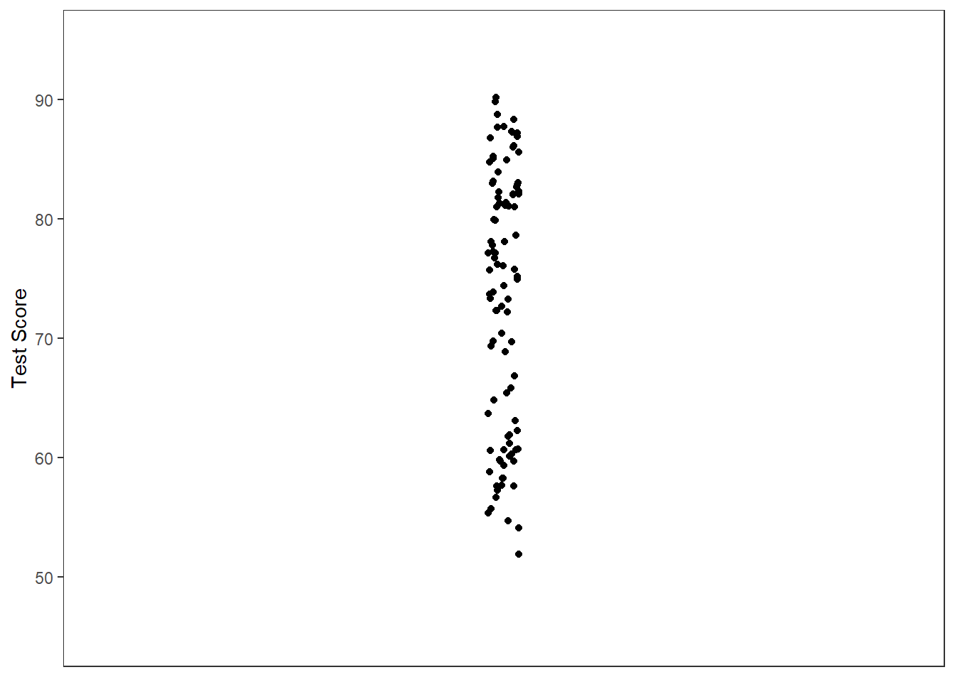
One of the goals of statistical analyses is to understand why scores vary. In the “quasi-scatterplot” of Figure 1, we have no explanation as to why the scores are different. Furthermore, if we want to make a guess about what value we might randomly select from the population, the best guess (that is, least biased, not necessary most accurate) is the mean of all of these score (i.e., the grand mean). Figure 2 has the grand mean added as a solid black bar.
Figure 2
Quasi-Scatterplot with Mean
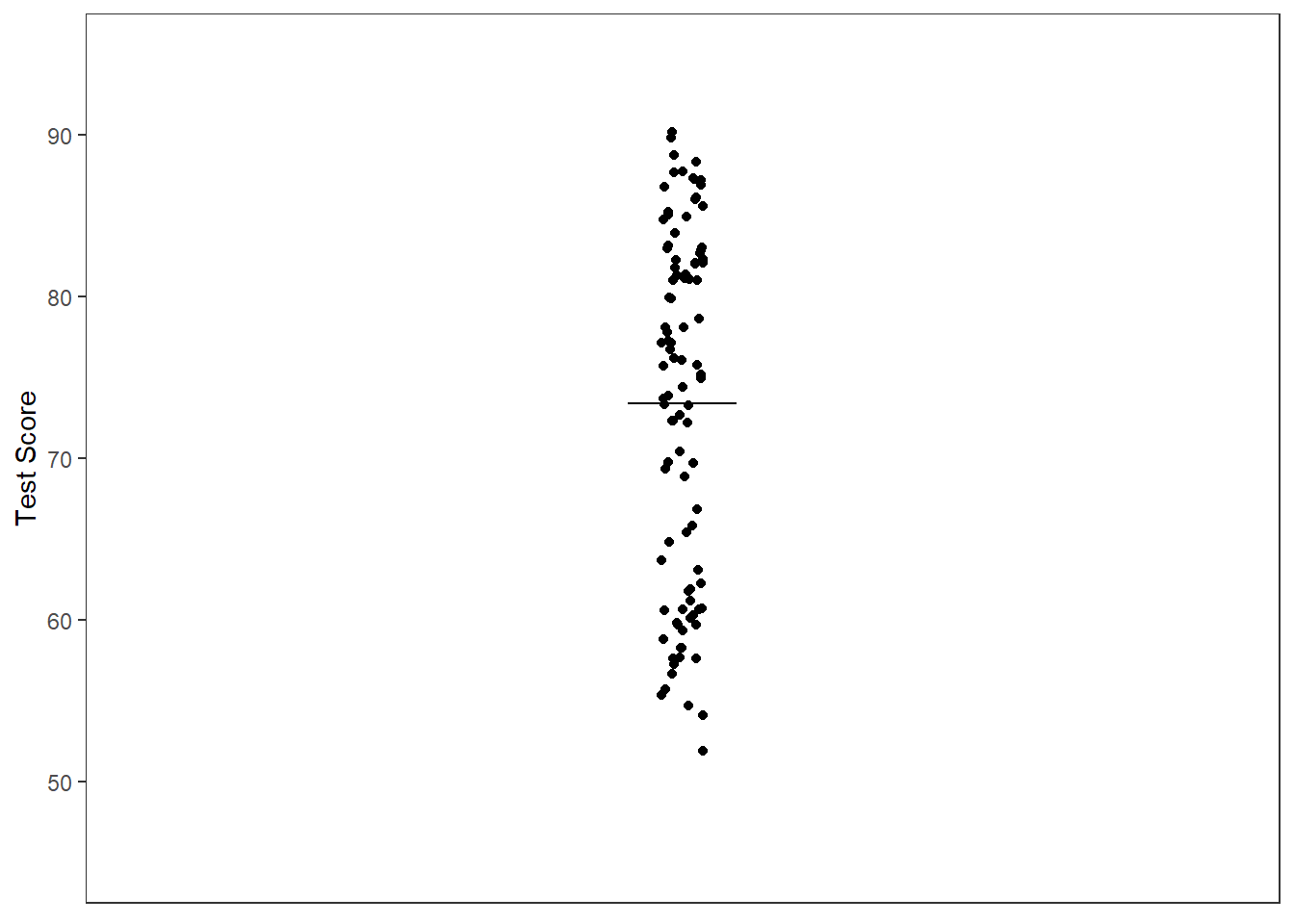
Note. Solid black bar represents the grand mean.
As you can see from Figure 2, some of our points are close to our “estimate” while others are far. The difference between our estimate and the actual data can be considered an error in prediction. We can reduce this error if we we learn more about our data set.
Let’s add in a predictor variable to our model. Let’s imagine that we had individuals use one of three study techniques: no studying, flash cards, or quizzing. Figure 3 includes this information through color coding the points.
Figure 3
Quasi-Scatterplot of Test Score and Study Technique
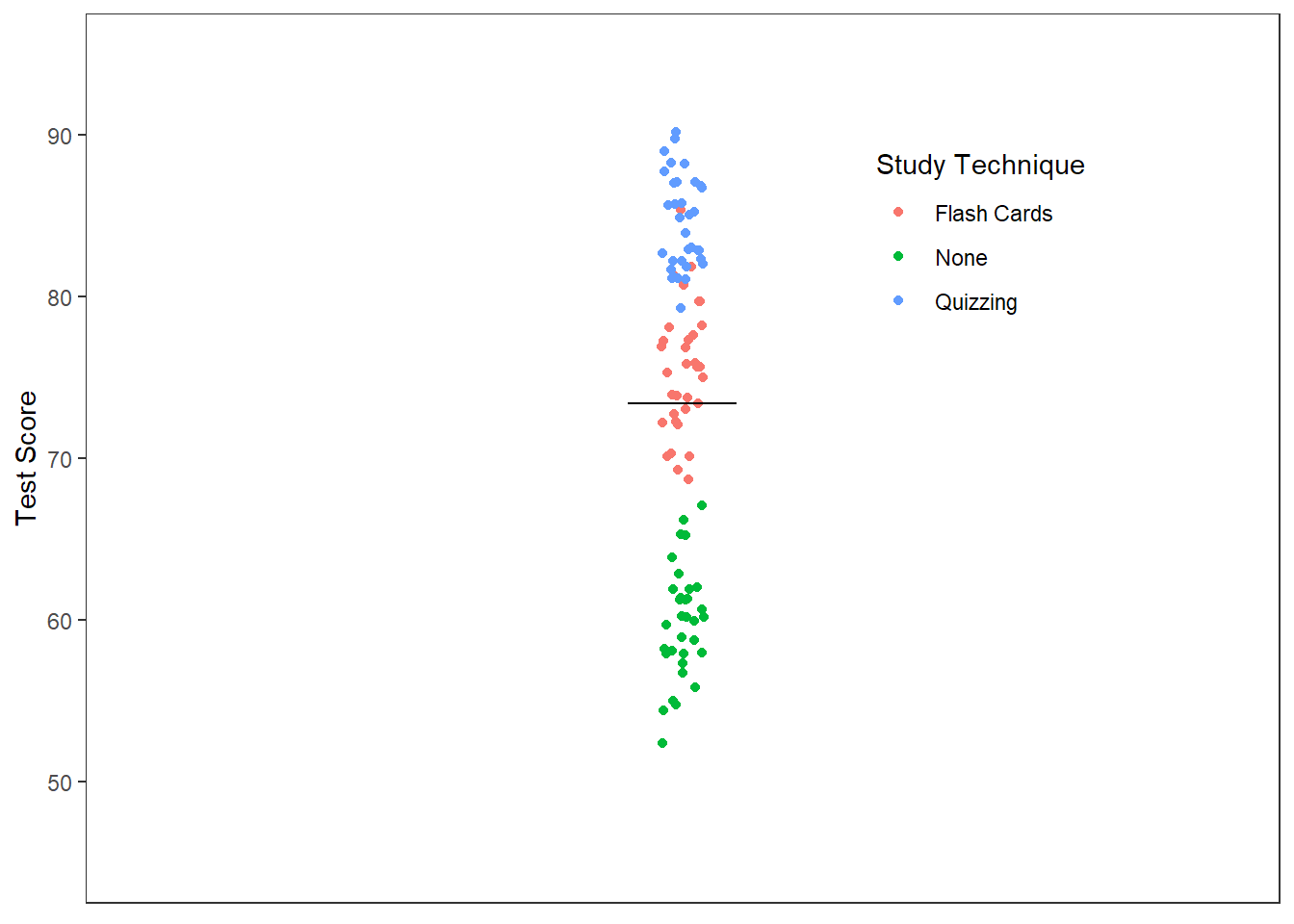
Note. Solid black bar represents the grand mean.
The differences in scores seems to be influenced, in part, by the study techniques used. Perhaps a better (i.e., more accurate) guess would be to use the sample mean for the group in which you are interested. That is, instead of asking "what is the likely test score for any given student?" we should ask "what is the likely test score of any given student who studied using flash cards?" Figure 4 includes the sample means as dashed lines.
Figure 4
Quasi-Scatterplot of Test Score and Study Technique with Means
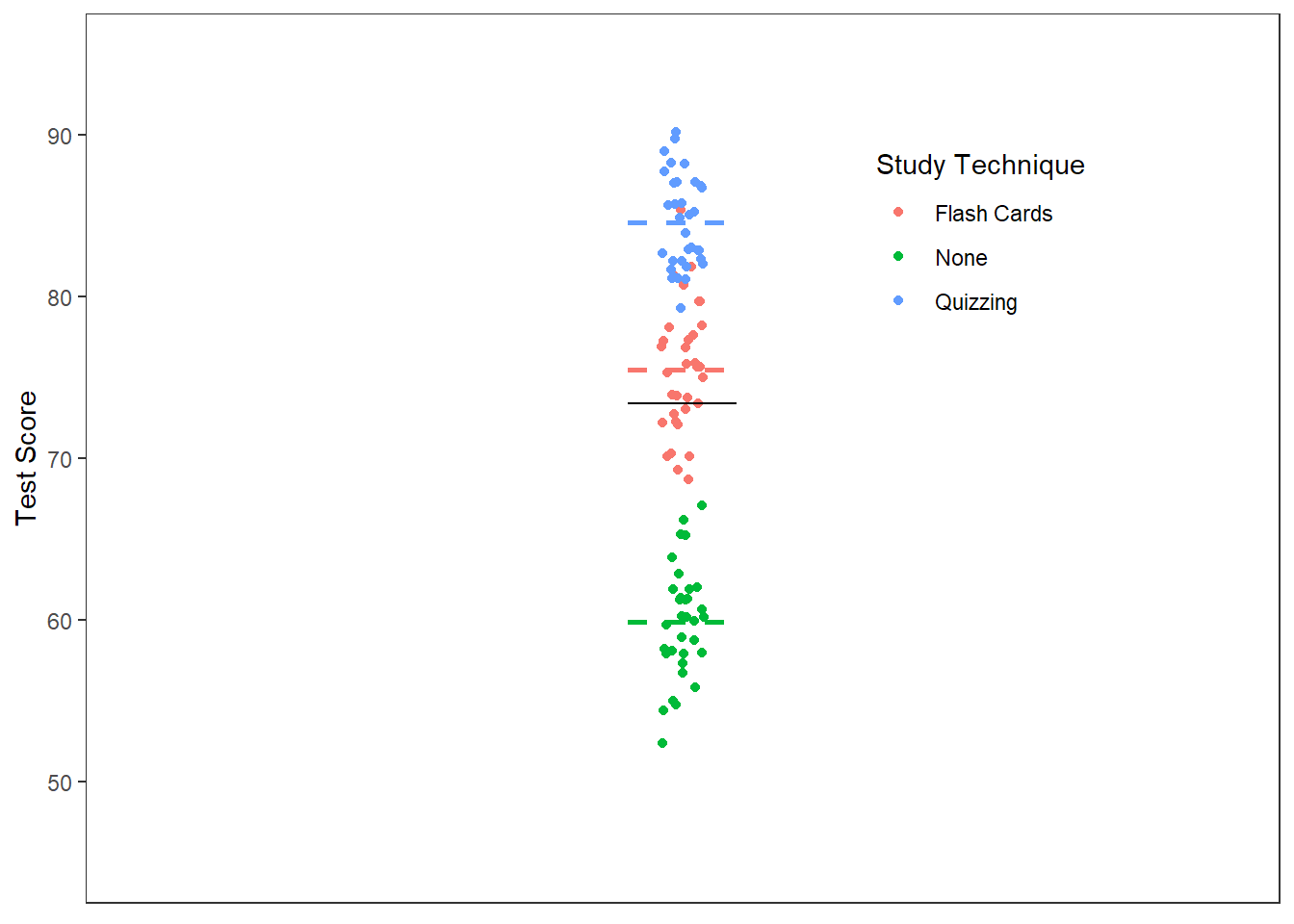
Note. Solid black bar represents the grand mean. Colored dashed bars represent group means.
We can now partition our estimation error into two sources of variance. We have the variability of the scores due to group membership (i.e., the effect plus sampling error) and the variability of the scores due to sampling alone. Stated differently, we are better able to predict what a score will be by knowing its group membership than nothing at all. However, we still are unsure why the scores in a given group differ.
The unexplainable variability is the error in our fraction. There are various reasons for that error, but we can assume that it has to do with things outside of our study. As such, we’ll chalk up that variability to differences in our samples. Just like in the independent samples t-test, we will combine the sampling error from all of the samples.
The next section will put these concepts into more concrete terms by walking through the calculation procedure for ANOVA. You will not need to perform any of these calculations but to better understand the output from jamovi, you should know the process.
Calculating ANOVA
A useful way to think about how ANOVA approaches comparing multiple groups is thinking about farming. Imagine that you’ve got a little plot of land on which you want to grow some strawberries. You’ve gotten some advice from friends and DIY farming websites about what makes strawberries grow best. A friend tells you that sugar water as a fertilizer makes strawberries sweeter. The DIY website claims that MiracleGro is the fertilizer to use. Being a scientist, you decide to test each suggestion against a control of just water. Imagine that Table 1 represents your land and the the scores represent the sweetness rating (out of 10) for each plant in the given treatment group.
Table 1
Representation of Split Plot Design
| Water Only | Sugar Water | MiracleGro |
|---|---|---|
| 4 | 1 | 7 |
| 5 | 2 | 8 |
| 6 | 3 | 9 |
We can already see how the scores are partitioned into the groups but we’ll want to summarize each treatment group with a mean. We’ll add that to the bottom of the table. The bottom and sides of the table are referred to as the margins of the table. As such, we will call these the marginal means. Table 2 contains the marginal means
Marginal Means are the means calculated for the levels of an independent variable.
Table 2
Table with Marginal Means
| Water Only | Sugar Water | MiracleGro |
|---|---|---|
| 4 | 1 | 7 |
| 5 | 2 | 8 |
| 6 | 3 | 9 |
| --- | --- | --- |
| 5 | 2 | 8 |
Note. The grand mean of strawberry sweetness is 5.
To measure the effect, we will want to compare how different all of the average sweetness are from the overall sweetness (e.g., the grand mean). To measure the error, we will want to compare how different each score is from that group’s score.
Table 3 rewrites each value as a difference score. The individual plant sweetness scores are compared to the mean of its treatment group. The marginal means are compared to the grand mean.
Table 3
Comparing Scores to Means
| Water Only | Sugar Water | MiracleGro |
|---|---|---|
| -1 | -1 | -1 |
| 0 | 0 | 0 |
| 1 | 1 | 1 |
| --- | --- | --- |
| 0 | -3 | 3 |
Note. The grand mean of strawberry sweetness is 5.
Notice that the difference scores are larger in the marginal means than within each group. This may foreshadow the outcome. To get to a final number, we will want to add these scores together. We’ll have to square them to avoid losing information (after all, -1 + 0 + 1 = 0). Table 4 contains the squared difference scores.
Table 4
Squared Difference Scores
| Water Only | Sugar Water | MiracleGro |
|---|---|---|
| 1 | 1 | 1 |
| 0 | 0 | 0 |
| 1 | 1 | 1 |
| 0 | 9 | 9 |
Note. The grand mean of strawberry sweetness is 5.
We further summarize these different scores by adding up these squared difference scores. We want to maintain all of the information from the original data set. So to account for the “impact” for each individual score we’re going to multiply the squared difference score of each group’s marginal mean and the grand mean by the number of observations in that group. Table 5 contains the weighted difference scores.
Table 5
Weighted Squared Difference Scores
| Water Only | Sugar Water | MiracleGro |
|---|---|---|
| 1 | 1 | 1 |
| 0 | 0 | 0 |
| 1 | 1 | 1 |
| 0 | 27 | 27 |
Note. The grand mean of strawberry sweetness is 5.
We can then add up all of these difference scores into the the sum of squares for the “effect” and the “error”.
The last bit we need to do is to turn these sums into variance (it is analysis of variance after all). We do this by dividing by degrees of freedom rather than the number of scores.
The degrees of freedom are equal to the number of observations minus the number of reference means.
For the effect of treatment, we have three marginal means that we are comparing to the grand mean (our reference mean). The degrees of freedom are thus
For the error, we have 9 observations compared to three marginal means. We thus have
Our variances for effect and error are:
The ANOVA approach is to compare the variability in group scores to the variability of individual scores in the groups. We can thus write our fraction as:
Our fraction turns out to be
We have not yet determined if there is any difference due to treatment, however. How do we interpret 27? We need a reference. We need the F-distribution
The F-Distribution
The value we've just calculated is known as an F-value (perhaps named after Ronald Fisher who developed the ANOVA technique in to the closest form we use today). The F-value we obtained is just one of an infinite number of F-values we could have obtained, but they are not equally likely. These values have expected distributions, depending on the number of groups and the sample size (see figure 5)
Figure 5
The F-distribution Family
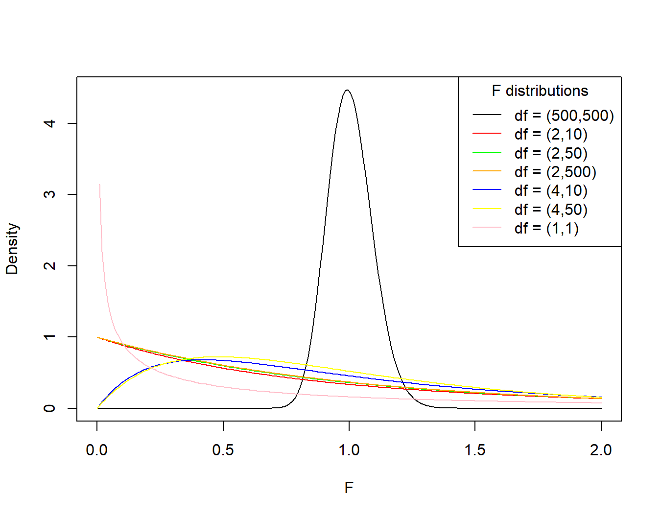
Note. The first number in the parentheses for the legend is the degrees of freedom for the numerator (number of groups) and the second is the degrees of freedom for the denominator (sample size).
There is a lot going on in figure 5, but the key takeaway is that the probability of getting a particular value of F (or more extreme) is determined, in part, by the design of your study. The shape of the distribution tells us about how likely one is to obtain a range of F-values, under the assumption of the null hypothesis. Figure 5 shows a few f-distributions as probability density function plots.
Null Hypothesis: a statement of the default assumption regarding the relationship being tested. For ANOVA, the null hypothesis is that there is no differences in groups, or that all samples are derived from the same population.
Here is how to read a probability density function plot. The values of the statistics (or whatever set of values you are calculating or observing) are marked on the x-axis and the y-axis represents the probability density for each value on the x-axis. Probability density is a ratio of probability per unit of the scale. The area under the curve (found through integrating the probability density function) for a range of values gives us the probability of obtaining a value in that range.
That can make one's head spin. Let's put this in terms of speed, which is equal to
Imagine that we had speed on the y-axis and time on the x-axis. Our plot would then tell us the speed of an object at any given time. If we wanted to know the total distance traveled between two points in time, we would integrate that speed function between Time1 and Time2. Similarly, if we want to determine the total probability between two values, we would integrate the probability density function between Value1 and Value2.
Before we get too worried about calculus, remember that this is a computer applications course, so we'll let the software take care of this for us. So, for any obtained value of F, jamovi will give us the probability of obtaining that value of F (value1) or larger (value2 is infinity, ∞) based on the number of groups and sample size included, assuming the null hypothesis. This value is referred to as the p-value. For our example, we have F(2,6) = 27, p = .0001.
We now have an F-value and an associated probability, the p-value. Does this tell us if we should consider there to be a difference between the treatment conditions? To complete the process of Null Hypothesis Significance Testing, we need to compare our p-value to the α-level. If the p-value is less than the α-level, then we can claim that our result is not due to chance alone.
Null Hypothesis Significance Testing is an approach to determining the statistical significance of an outcome by comparing the probability of obtaining a result to that expected by chance alone (the α-level).
α-level (alpha-level) is the acceptable Type I error rate determined before the start of the experiment/analyses. In psychology, this has traditionally been set to .05 or
Type I Error Rate is the proportion of false positive results, or the number of observations claimed to be an indication of a true effect, but actually due to chance alone.
How can we come to this conclusion? Recall that the p-value is the probability of getting our result under the assumption that there is no difference among our groups. When the p-value is less than .05, we can argue that there is less than a 5% chance that our result comes from just one population and that it is more likely to have come from different populations. That is, less than 5% seems too unlikely to continue to hold the assumption that there is no difference among groups. In our example, the p-value is less than α, so we can claim a statistical significantly effect of treatment. Ultimately, statistical significance is a way to argue for reliability.
Reliability is a measure of how well a result can be repeated across different samples.
Next Steps
We've come a long way but we are not finished yet. We have only established that there is likely an effect of type of fertilizer on sweetness of strawberries but we have not established which of the treatments are statistically significantly different. This requires post-hoc analyses, which will be covered in the next post.
Summary
The analysis of variance approach is a subset of the general linear model that allows one to determine if observations come from one or multiple populations by partitioning differences in scores across different groups. The approach an F-value, which is a ratio of difference due to group and due to sampling error alone. A p-value can be obtained for the obtained F-value, number of groups, and sample size. This p-value is then compared to an α-level to determine statistical significance. If there is a statistically significant effect, one will follow-up with a post-hoc test to determine which groups are statistically different from other groups.