Descriptive Statistics
Descriptive StatisticsScales of Measurement RevisitedNominal ScaleOrdinal ScaleInterval and Ratio ScalesDescribing SamplesCentral Tendency and DispersionOther MomentsQuartilesCharts and FiguresBar ChartsHistogramsBox PlotsScatter PlotsAPA StyleClear & ConciseClarity in TablesLabel EverythingEasy to ReadHigh ContrastClarity in FiguresLabel EverythingEasy to ReadHigh ContrastConciseness in TablesConciseness in FiguresAPA Style in jamoviOverview of Example DatasetThe VariablesThe DataCreating APA-Styled Descriptive Statistics TablesMeans and Standard DeviationsFive Number SummaryCreating APA-Styled Descriptive Statistics ChartsQ-Q plotsInterpreting Q-Q PlotsArchingSnakingCreating Q-Q plotsSummaryReferences
Humans like patterns. We will often impose patterns when they are not there. Paeidolia is the phenomenology of Gestalt psychology. That is, the experience of seeing faces in our toast is explained by the perceptual properties outlined by the gestalt psychologists. Remember that “the whole is other than the sum of the parts.” See figure 1 for an example.
Figure 1
Pareidolia Toast

What does seeing religious figures in our buttered toast have to do with statistics? Everything! Let me explain. When we receive information from our experiences, it is often an under-sampling of reality (i.e., not the whole picture). Furthermore, we like to put our own interpretation on that information when forming a conclusion. As such, as we summarize the information we receive from the world, we often form biased conclusions. People (statisticians included), are not very good at accurately summarizing reality.
What we need is a framework to help us consolidate the raw information into something that is both accurate and helpful in guiding our understanding. The “descriptive” branch of Statistics does just that. It provides us with a set of tools on how we can summarizing different kinds of distributions. These summarizations are crucial for the next step: inferential statistics.
Before we go on to the actual summaries, let’s review the scales of measurement. How we summarize a distribution is dictated, in part, by the scale of measurement for the variable.
Scales of Measurement Revisited
Recall the four scales (ascending in amount of information contained)
- Nominal: values differ by kind.
- Ordinal: values differ by order or degree.
- Interval: values differ by fixed amount.
- Ratio: values differ by fixed amount with absolute zero.
How might we summarize the values in each of those scales of measurement? How do those summaries differ in the information they provide? Let’s walk through them.
Nominal Scale
In this scale of measurement, the values differ by kind. That is, the values are qualitatively different. The difference can’t be expressed by change in the amount of some quantity. We could imagine that we had a bag of Reese’s pieces (I imagine this often…) and we want to summarize information about the color of the pieces. I think, intuitively, we would want to sort the pieces into piles based on their colors. We could then tell others about how many different colors there are. While writing this, I realized that others may not share my exuberant liking of Reese’s products. For those in that camp, please see Figure 2 then procedure to your nearest food retailer and treat yourself to some chocolate, peanut butter joy.
Figure 2
Reese’s Pieces
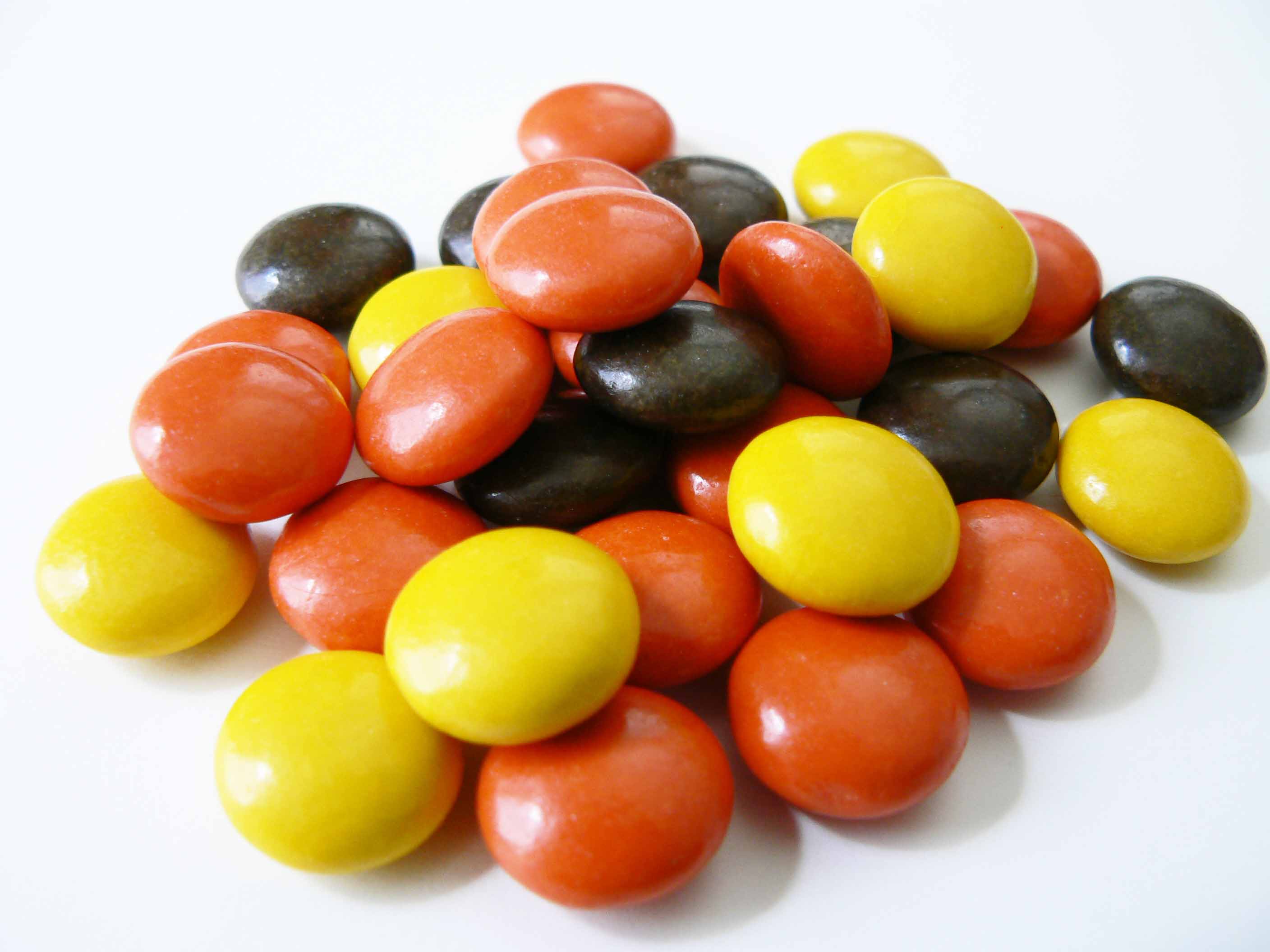
Figure 2 indicates that we have 3 possible values for the color of a Reese’s Piece. That is a start but it doesn’t tell us a lot about the distribution of those values. That is, it doesn’t tell us much about what the composition of the bags looks like. What we need is a frequency distribution. A frequency distribution is a summary of how many of each possible value is present in a sample. For our example, we would report how many of the pieces from our bag were yellow, how many were brown, and how many were orange.
Frequency Distribution: a collection of value-count pairs that summarizes how often each value of a variable appears in a sample.
Sad story: I do not currently have any Reese’s Pieces to count. However, because we live in a very interesting time in human history, I was able to watch a YouTube video in which a young man and a young woman counted the number of Reese’s Pieces in an 8 oz bag. I skipped to the end to find that they counted 305 in total but they did not break down the number of each color. Although my search for information about the proportion of each color was unsuccessful, we can use the sample provided in Figure 2 to determine our counts. I count 8 yellow, 8 brown, and 15 orange candies. We would summarize this frequency distribution in a table like in Table 1
Table 1
Frequency Distribution of Reese’s Pieces Colors
| Color | Count |
|---|---|
| Yellow | 8 |
| Brown | 8 |
| Orange | 15 |
Note: Dr. Weaver likes all the colors of Reese’s Pieces as they all taste the same.
We’ve summarized information from 31 Reese’s pieces down to 3 numbers. What if someone really pressed you for just one number; the best summarizing number? You should tell them to shove off because they are ignoring relevant information about the data. However, if someone asked you for the frequency distribution *AND* one summarizing number, you could offer the mode. The mode is the most frequently occurring variable value in the sample.
Mode: a summarizing statistic that represents the most commonly (i.e., highest count) occurring variable value in a sample.
The mode is helpful because it offers us a “best guess” about what we are likely to select out of our bag of Reese’s Pieces. That is because, in frequentist approaches, higher frequencies = higher probabilities. In our example, the modal value is “orange” so we would suspect that we would be most likely to randomly select an orange Reese’s Pieces from the bag.
To summarize our summarizing of data assessed on a nominal scale, we can count the number of observations that match the different possible variable values and we can refer to the modal value of that frequency distribution.
Ordinal Scale
The ordinal scale is familiar to psychologists. It is more informative than the nominal scale and less informative than interval or ratio. If psychologists were on a dating site looking for the perfect scale of measurement, they would really like to be matched up with the ratio scale but those scales are too involved with physics it seems. Those physicists are the ones defining time, weight, and other variables that work so well with ratio scales. They even defined “absolute zero” for temperature!
Psychologists would settle for some attention from interval scales, really. They have that nice structure in their values. We like a scale that has a strong sense of values. Every once in a while, psychologists get time with ratio scales (i.e., reaction time) or interval scales (i.e., standardized test scores) but we are often stuck in that familiar dance with ordinal data.
The ordinal scale of measurement is marked by values that indicate more or less of some concept without providing the exact amount of change between values. Imagine if you were only given the placements of those who were in a race. Pepper O’Knee came in first, Sal Ami came in second, and Beau Loney came in third. Unfortunately, we don’t really know how much faster Frank is than Sal or Sal is than Beau. We don’t even know how long it took anyone to finish the race.
Cured meat puns aside, psychology is riddled with these measurement issues. I’m an emotions researcher and I have no idea how to know how happy someone is other than asking them to indicate it on some arbitrary scale. Without fixed intervals on this happiness scale, I don’t know how much more happy someone is when they rate themselves as a 7 versus a 9. Furthermore, without an absolute zero on the happiness scale, I can’t really compare individuals. Is all lost? should psychologist just stay off ScaleMatch.com? All is not lost, we can still make comparisons across groups and we can still try to anchor individuals on these ordinal scales. We can still summarize the patterns on these scales.
We can summarize with a frequency distribution and we can offer the mode. However, because we do have order information, we can incorporate the rank of the values into our summary. In general, we can summarize any number of percentiles. A percentile is the value at which a certain proportion of observations are below that value. For example, I could report that a happiness score of 8 is the 75 percentile. That is, 75% of happiness score are below 8. If you recall from previous classes, we have a summary statistic that we offer as a central marker of ordinal data. The median is the value at which 50% of observations fall below.
Median: the value at which 50% of observations are below.
We can and should include more summarizing information about ordinal data distributions. The median is our measure of central tendency, or the value which describes the center of the distribution, but that leaves out information about the values that are not at the center.
Central Tendency: values that indicate the center, or bulk, of the data in a distribution. Options for measures of central tendency include the mode, median, and mean.
We need something to summarize how different or spread out the values are and we have some options. The most basic measure of dispersion is the range. The range is the span between the largest value and the smallest value in the data set.
Dispersion: values that indicate spread or variability in the data.
Range: the difference of the largest and the smallest values in the data set.
Not bad, but we can do better! Rather than just incorporate the most extreme values, we can provide an more nuanced summary by looking at the middle 50% of the data. The interquartile range or IQR is the span from the 75th percentile to the 25th percentile. Whereas the range can be very large because of unusual data (for the distirbution, that is), the IQR nicely describes how different the bulk of the data are.
Interquartile Range (IQR): The difference of the 75th to the 25th percentiles.
The other advantage of the IQR is that, regardless of the shape of the distribution, it is still a useful summary of dispersion. That is, even when the data are skewed because of outliers (see Figure 3 for an example)
Figure 3
Income Distribution in the U.S.
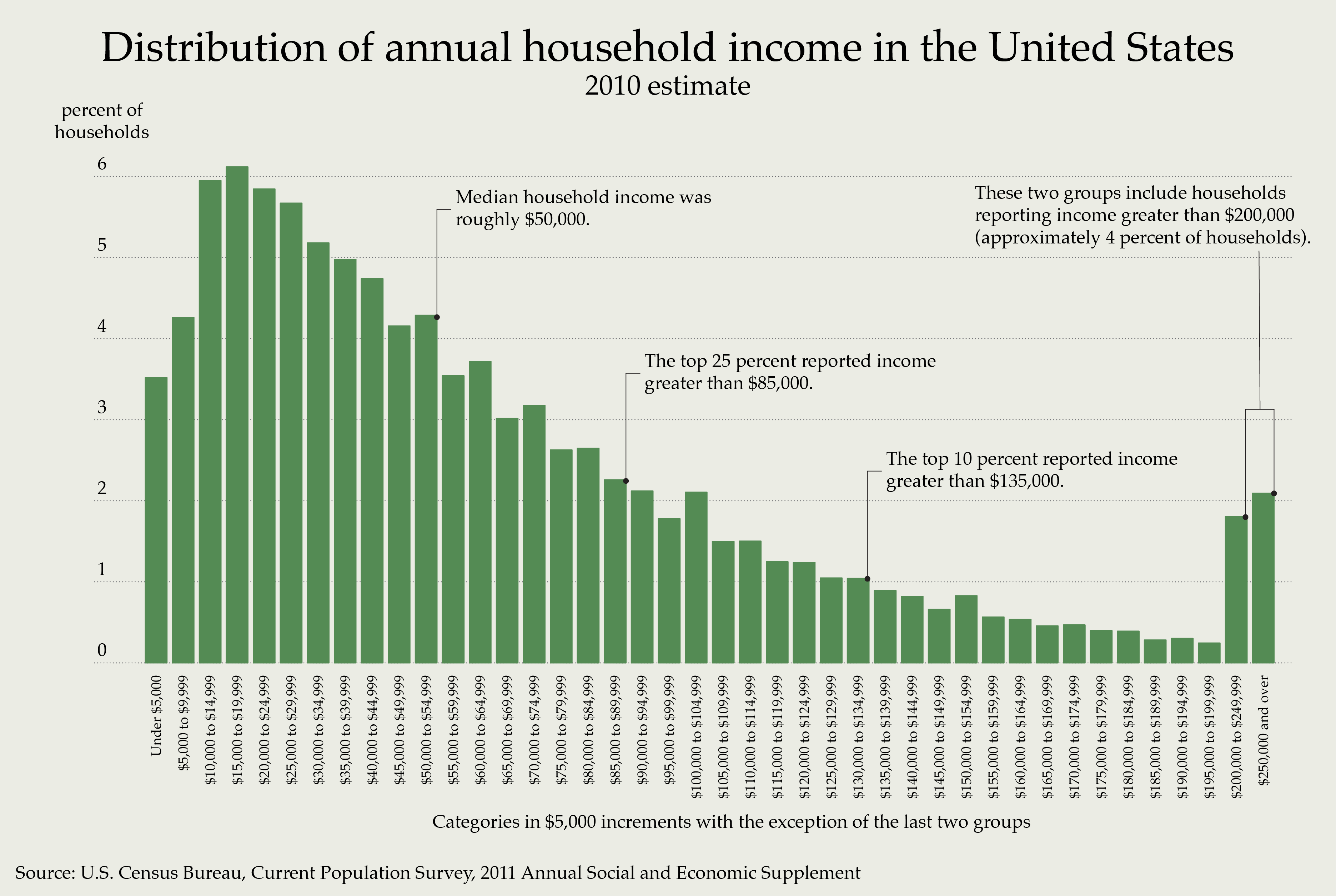
The summary measures associated with ordinal data are informative and useful, especially for skewed distributions. We can provide a frequency distribution, report percentiles (especially the median for central tendency), and the interquartile range (for dispersion).
Interval and Ratio Scales
Quick recap. Psychologists want to work with interval and ratio data (and Pepper O’Knee is the fastest on the charcuterie board) because they have fixed intervals. The main reason that this is a positive characteristic is because of what we can say about the data. When someone scores a 5 on a math test and someone else scores a 7, we know that difference is the same difference as when one person scores a 9 and the other scores an 11. Taking it further, if someone scored a 5 and the other scored a 10, we can claim that student #2 earned twice as many points as student #1. We could not have really said this if we were assessing happiness scores. There is still the problem of whether we are actually assessing math ability or skill with our math test but this chapter isn’t about validity.
With the extra information in each scale, we can utilize some more arithmetic. Namely, we can meaningfully add and subtract values with interval data and we can multiply and divide with ratio data. These operations allow us to summarize the central tendency with the mean and dispersion with variance and standard deviation. The mean is the arithmetic mean, which is calculated by summing the values before dividing by the number of values. We really like to calculate the mean, when appropriate, because it includes all values in its calculation. That means (really not an attempt at a dad joke) it is the most information-rich measure of central tendency we can calculate. For a perfectly normally distributed sample, the mean is equal to the median and is equal to the median.
Mean: typically the arithmetic mean in which the values are summed before being divided by the number of observations.
Variance is a similarly rich summary of dispersion. Recall that the range and the IQR only used two values from the sample. Variance tells how different a value is from the mean, on average. The calculation involves subtracting each value from the mean, squaring the difference, adding up all the differences, then dividing the sum by the number of values. The problem with variance is that the units are now squared, which is weird. Squared degrees Celsius? Squared Thousands of Dollars per year? To get around this, we calculate standard deviation by simply taking the square root of variance. The general interpretation is the same: the larger the value, the less similar the scores (i.e., more spread out).
Variance: a summary of how different the values are from the mean, on average.
Standard Deviation: the square root of variance (to return dispersion to normal, unsquared units).
Table 2 compiles this information succinctly.
Table 2
Most informative Summary Statistics by Scale of Measurement
| Measurement | Central Tendency | Dispersion |
|---|---|---|
| Nominal | Mode | Range |
| Ordinal | Median | IQR |
| Interval | Mean | Std. Dev. |
| Ratio | Mean | Std. Dev |
Describing Samples
Central Tendency and Dispersion
In the service of our ultimate goal of understanding patterns in data, it is helpful to offer summaries of data. The summaries we can utilize may be dependent on the scale of measurement of our data. In general, we want to offer some value that describes the bulk / center of the data and some value that describes the spread of the data. We can actually describe the data a few more ways.
Other Moments
Whereas the mean tells us where the data are centered on the number line and variance (or standard deviation) tells us how spread ou the values are about the mean, we can also describe the shape of the distribution. Skewness refers to the unbalance of the distribution. Figure 4 presents positively skewed, symmetrical, and negatively skewed distributions.
Figure 4
Skewed and Symmetrical Distributions
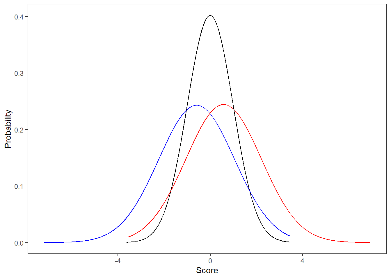
Skew summarizes the amount and direction of the unbalance by changing the formula for variance slightly. Whereas variance finds the average squared distance (i.e., all values are positive) of each point from the mean, Skew finds the average cubed difference. This leaves the negative values negative and the positive values positive before adding them up. As such, if we have a negative value, there is more distance between the points below the mean than those above. For a positive skew value, there distance between the mean and those above the mean is greater than below the mean. If the skew value is zero, the distances are perfectly balanced. In general, we consider a distribution to be “normal” enough if skew is between -3 and +
Skew: summarizes the amount of imbalance in a distribution by adding the cubed differences between points and the mean. A general acceptable range of skewness is -3 to +3.
The other summary for the shape of a distribution is kurtosis. Kurtosis refers to the “tailedness” of a distribution. If you recall the empirical rule, we have certain assumptions about the proportion of observations that should fall in different ranges of our normal distribution. Kurtosis is a measure of deviation from that expectation. Kurtosis is another “moment” of the distribution, the fourth moment. It is calculated by comparing summing the distances between observations and the mean to the fourth power before dividing by the squared variance. All this really means is that this formula will enhance the potential outliers (i.e., values greater than a few standard deviations from the mean). There are three classifications of distributions according to kurtosis: mesokurtic, leptokurtic, and platykurtic. These roughly align to no kurtosis, positive kurtosis (heavy tails), and negative kurtosis (thin tails). The acceptable ranges for assuming normality for kurtosis is between -8 and +8.
Kurtosis: summarizes the tailedness of a distribution. A general acceptable range of kurtosis is -8 to +8.
Quartiles
Another approach to describing the shape of the data is to identify key “mile markers” in the data. That is, we can list the values below which certain proportions of the data are found (i.e., percentiles). We can pick any that we wish but the standard are the quartiles. If percentiles are found by dividing the distribution into 100, quartiles divide the distribution into quarters or fourths. As such, the first quartile (Q1) is the value at which 25% of observations fall below, Q2 is the median (50% below), Q3 has 75% below and Q4 is the maximum (100% below).
We can put these into a nice five number summary by including the minimum with the quartiles. Such a summary is presented in Table 3 below.
Table 3
Five Number Summary
| Statistic | Min | Q1 | Median | Q3 | Max |
|---|---|---|---|---|---|
| Value | -24 | -0.7 | -0.06 | 0.65 | 63 |
There are variations on this theme, but generally we want to provide useful summaries regarding the center, spread, and shape of a distribution. Table 4 contains more of the typical parametric summaries. By parametric, I am referring to values related to the mean.
Table 4
Parametric Summaries
| Statistic | Min | Mean | SD | Max | Skewness | Kurtosis |
|---|---|---|---|---|---|---|
| Value | -24 | -0.03 | 1 | 63 | 0.02 | -0.02 |
Charts and Figures
So far, we’ve presented our summaries in tables. Tables are great for presenting the values of your statistics. Charts and figure are nice for comparisons and quick judgments. We’ll use different figures to present the values and to make judgements regarding the normality of our distributions. For now, we’ll discuss the following:
- Bar charts
- Histograms
- Box plots
- Scatter plots
Bar Charts
Bar charts are ubiquitous because they do help to clearly communicate the comparison of groups. An example bar chart can be found in Figure 5 below.
Figure 5
An Excellent Bar Chart Example
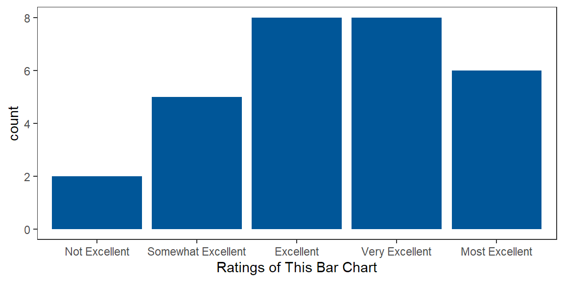
Figure 5 is basic in that it only provides information about how often each rating showed up in the sample. We can get more information in a bar chart by including more information about samples. Figure 6 includes means and 95% confidence intervals for each sample being compared.
Figure 6
Comparing Samples with a Bar Chart
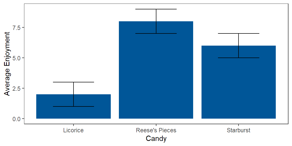
*Note. Error bars represent 95% confidence intervals.
Wow, can you believe that my imaginary sample reported “Reese’s Pieces” to be the most enjoyable?! I can, because they are delicious! What is really nice about these kind of bar charts is that you can make some quick inferences about reliable differences between samples. Because the 95% confidence error bars do not overlap for the enjoyment ratings of licorice and Reese’s Pieces, we can claim that there is less than a 5% chance that our enjoyment ratings came from the same population. We didn’t even need a t-test for that. Nice!
Histograms
Histograms are like bar charts but require special data and can only display certain information. Histograms are for continuous data and the bars represent frequency. Histograms are useful for judging the shape (e.g., normality) of a distribution. Figure 7 is a histogram.
Figure 7
A Boring Histogram
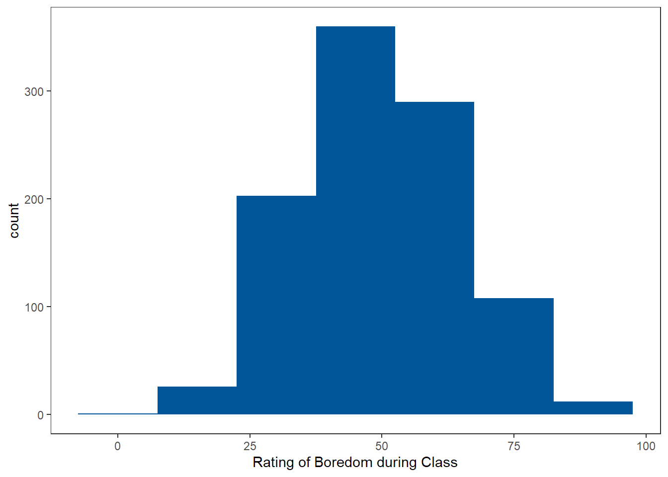
Clearly this sample did not come from my class as I’m sure that all of my students would indicate 0! Fantasies aside, we really use histograms to quickly judge if distribution is roughly normal or is skewed to the left or right.
Box Plots
Box plots are another way to represent information about a distribution but it summarizes the quartiles rather than the counts of different ranges of variable values. Figure 8 demonstrates how boxplots can be used to compare sample distributions.
Figure 8
Box Plots to Compare Samples
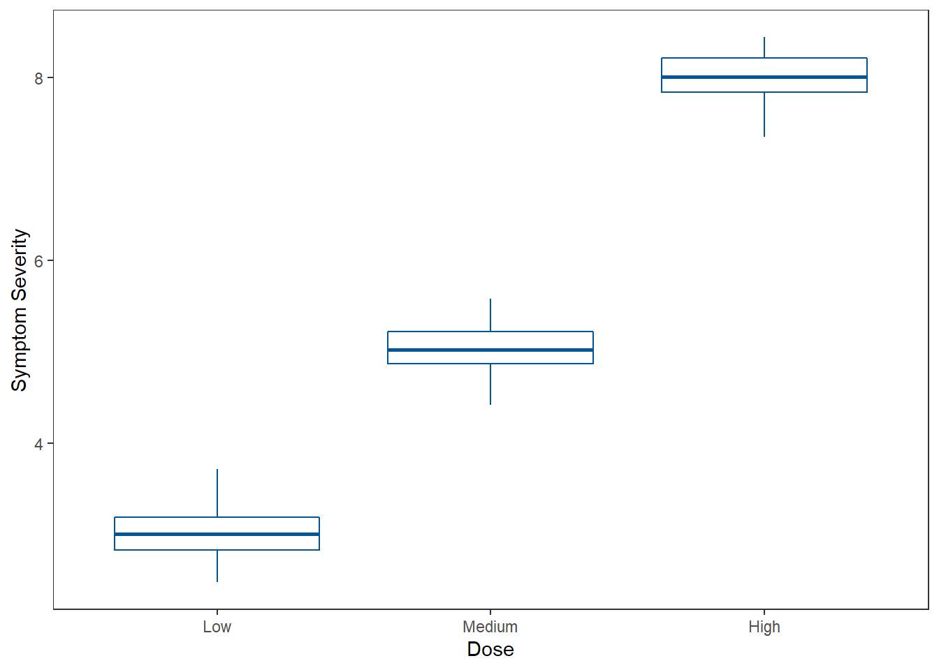
The middle horizontal line of the box plot represents the median (Q2 or 50th percentile). The bottom horizontal line is the first quartile and the top horizontal line is the third quartile. The “whiskers” are the vertical lines. They extend to 1.5 times the interquartile range (IQR) above the 3rd quartile and to 1.5 times the IQR below the 1st quartile. Lastly, the dots represent outliers that are beyond the 1.5 IQR cutoff.
Scatter Plots
Should you have two continuous variables, you can check the direction and strength (i.e., judge correlation) by producing a scatter plot. Scatter plots have the values of one variable along the x-axis and the other variable’s values along the y-axis. A point is then plotted for each entity/individual at the intersection of their values for each variable. See Figure 9 for an example.
Figure 9
Scatter Plot Example
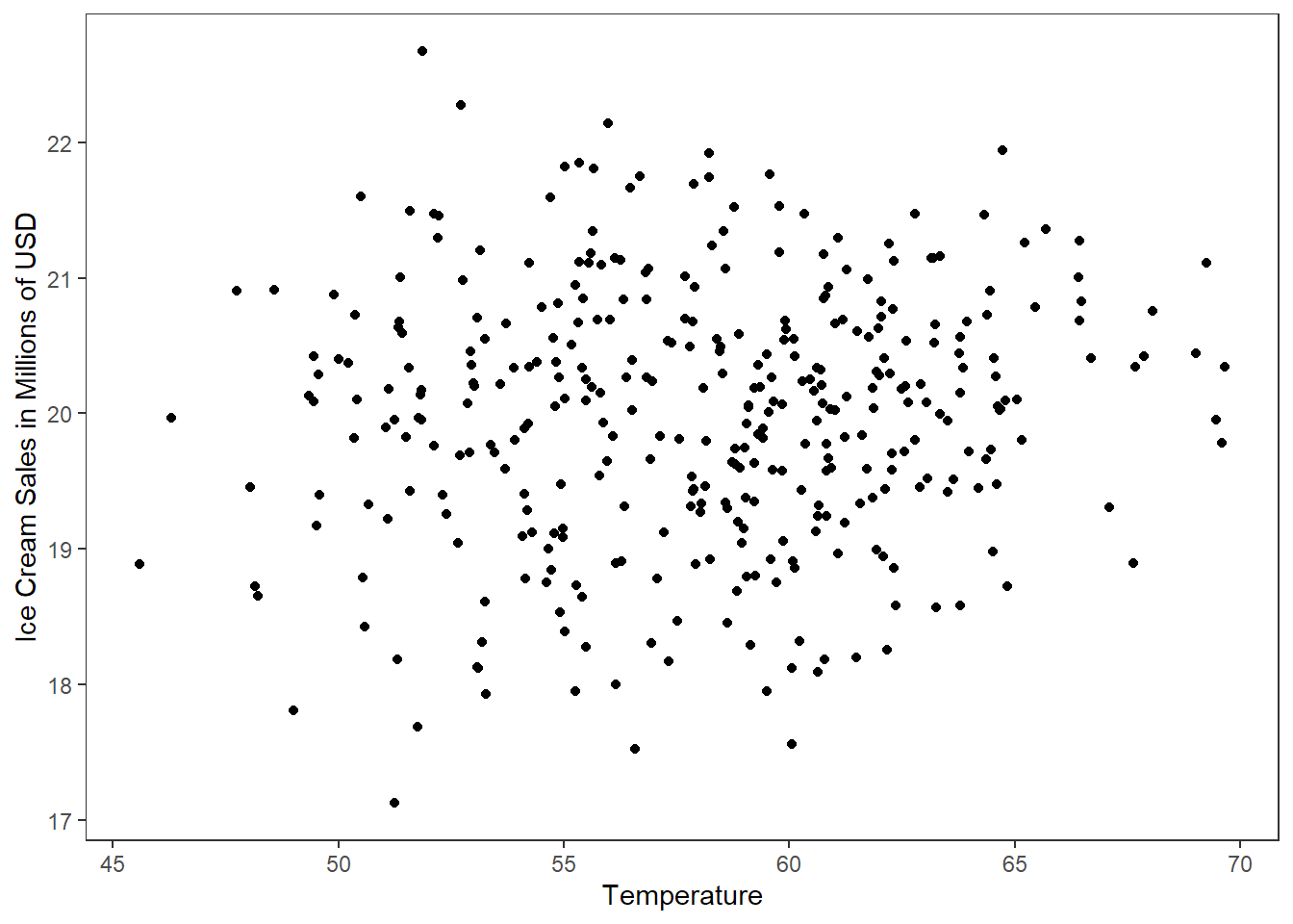
It can be difficult to judge reliable relationships from scatter plots alone, so I would recommend testing it formally through testing the correlation coefficient. Scatter plots are important because we are often interested in how two continuous variables are related. Unfortunately, correlation is outside of the scope of this course.
APA Style
One of the major goals of this course is to learn how to implement APA style when presenting statistical results. As the semester progresses, we will work on specific components required by different analyses, but I wanted to start with some general principles the guide APA writing and the creation of figures and tables.
Clear & Concise
The most important quality of scientific writing is clarity. To write clearly is to write in an unambiguous and complete manner. A reader should be able to read and understand your writing, with the appropriate background information. That means, in part, that you need to have an idea of what your readers may already know before they start to read your writing but it also means that you need to make clear the assumptions that you have. This is one of the reasons why we psychology professors are always harping on students about citations. It is more than just following the “rules” of APA writing, it is about providing resources for your reader should they need more information.
Here is an example of an unclear write-up:
“The analyses revealed that music impacted retention.”
Here is a clear revision of that write-up:
“The independent samples t-test revealed that those who listened to instrumental classical music retained 70% more information after a one hour retention period on the free-recall task than those who listened to lyrical pop music (t[298] = 5.32, p < .001, d = 1.3).”
The second example is more clear because it contains necessary information about which test was performed, the levels of the IV, details about methodology, how the DV was assessed, and supporting statistical information.
Clarity in Tables
The same concept of clarity can be applied to tables. To have a clear table, you must ensure that
- Everything is labeled
- Text is easy to read
- There is high contrast
Label Everything
For tables, each column should have an identifying label for the values that are contained below. Each row should label the grouping of the values (e.g., by participant, by level of IV, etc.). If there are any abbreviations or special information, they should be fully explained in the Notes section below the table.
Finally, the table itself needs to be labeled. This has been demonstrated throughout this OER. Each table is preceded by a bold “Table #”, in which the # is updated sequentially for each new table. Separated by a blank line, the next label is the actual title of the table printed in capital case (i.e., each non-functional word is capitalized) and italicized. Each table should be uniquely identifiable by the table number and table title. The title should be a concise description of what the table contains.
I’ll start with a bad example.
Table
Statistics
| Mean | SD | n | |
| Males | 85 | 2.1 | 57 |
| Females | 91 | 2.8 | 60 |
Why is this not a “clear” table? Let’s start at the top!
- The table number is missing.
- “Table” should be bold.
- The table title is not descriptive enough
- The table title should be italicized
- The first column is not labeled
Below is a corrected version.
Table 1
Descriptive Statistics for Friendliness Ratings by Sex
| Sex | Mean | SD | n |
| Males | 85 | 2.1 | 57 |
| Females | 91 | 2.8 | 60 |
This is still not a “good” table, but it has the labels worked out. Let’s move on to fixing the “readability” issues.
Easy to Read
If any group of professionals should understand what makes something easy to ready, it is psychologists. Part of the ease of processing written words on a page has to do with the gestalt principles of grouping, especially figure-ground. This is not a cognitive or sensation & perception class so I’ll just move on to telling you how to make this table easier to read.
First, we need to take away the clutter of all the borders. We need to make the text pop by giving it some surrounding empty space. In APA style, we do that by remove all vertical (i.e., | ) lines. We will also remove all the horizontal (i.e., - ) lines from the body of the table, where the values are.
Table 1
Descriptive Statistics for Friendliness Ratings by Sex
| Sex | Mean | SD | n |
| Males | 85 | 2.1 | 57 |
| Females | 91 | 2.8 | 60 |
Wow! That still looks terrible, but less terrible than before. Now we need to increase the distance between the values to help them stand out.
Table 1
Descriptive Statistics for Friendliness Ratings by Sex
| Sex | Mean | SD | n |
| Males | 85 | 2.1 | 57 |
| Females | 91 | 2.8 | 60 |
A little breathing room does a lot for the readability for this table. Lastly, we need to address the colors to enhance contrast.
High Contrast
I like color but it can get sometimes be counter to the overarching goal of clarity. Color should serve a purpose of clarifying information; it should not be used for artistic styling of scientific tables and figures. If you do use color, it should have a color-blind friendly palette and should have high contrast.
In our example, the yellow background and purple text do not serve to clarify content. Futhermore, the contrast is too low. The easy an appropriate solution is to remove all the color from the table. That is, the background should be white and the text should be black.
Here is our final table.
Table 1
Descriptive Statistics for Friendliness Ratings by Sex
| Sex | Mean | SD | n |
|---|---|---|---|
| Males | 85 | 2.1 | 57 |
| Females | 91 | 2.8 | 60 |
Clarity in Figures
We’ll actually follow the same rules for creating clear figures.
- Everything is labeled
- Text is easy to read
- There is high contrast
Label Everything
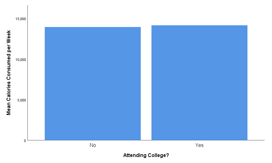
I know the saying (“a picture is worth a thousand words”), but we need actual words in our figures, too. We need a label for each axis.
Figure 10
Bad Figure
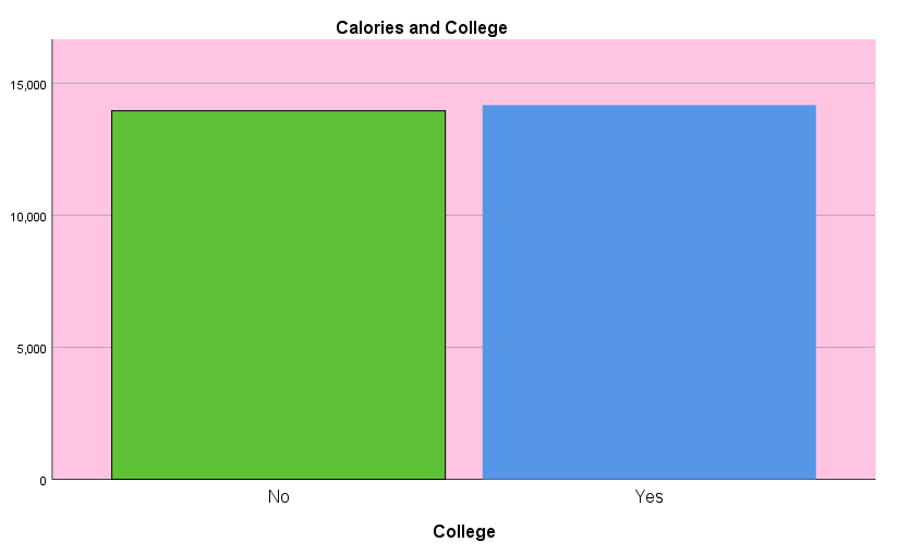
This will usually be the variable being represented on the axis. Sometimes, however, the y-axis will represent frequency or count in bar charts and histograms. If you have a legend or key, you’ll want to be sure that you have a label for that and what the pattern or colors represent.
What you do no want to have as part of your figure is a figure title. Per APA style guidelines, the title of the figure will be included in the text of your document, not the figure itself.
Figure 11 has some better labels.
Figure 11
Better Figure with Labels
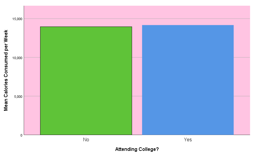
Easy to Read
Easy to read for a figure has several meanings. First, one should be able to actually read the words and values presented in the figure. That means that the font should be a basic font (a sans-serif) and should have an appropriate size. SPSS actually does a good job with the default font and size for readability.
The other interpretation of easy to read is “easy to understand.” That really boils down to simplicity. One should avoid overly busy figures. Think if two (although more) is easier for the reader to understand than one complex chart. Figure 12 is an example of a “too busy” chart.
Figure 12
Too Busy Figure
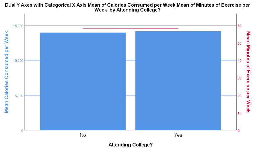
This figure has two y-axes, which means that the reader will have to decide what value corresponds to an element in the chart body. Although the chart is color coded, that is more information that the reader has to decipher. In general DO NOT USE TWO Y-AXES.
Another suggestion to make the figure easier to read is to utilize “negative space.” Just as we did in tables, we should remove extra lines that clutter the figure. We should, then, turn off any grid lines.
Colors should be used to convey information, not for aesthetics only. As such, you shouldn’t have colored backgrounds and bars, lines, and dots should only have color when they color indicates meaningful groupings.
High Contrast
By following the rules for easy reading (i.e., color, negative space), we may not need to make any changes for having “high contrast.” To be sure, however, you should have a white background and a medium to dark color for lines, bars, or points. You should ensure that if the chart was printed in grayscale, a reader would be able to gain the same information as if it were in color.
Figure 13 is a fully corrected figure.
Figure 13
Corrected Figure
Conciseness in Tables
Writing concisely does not mean writing briefly at the expense of clarity. Clarity should take priority over being concise. In most cases, however, you do not need to choose just one. This may be one of the few arenas in life in which you get to eat your cake and have it, too! In fact, cake recipes are a great example of how one should be clear and concise. You want a cake recipe that is clear in what ingredients to use, how much of each, and the procedure used to combine and bake those ingredients. As you’re working on your cake, you don’t want to read a short novel about the recipe writer’s experience in baking that cake. Short and sweet should describe their recipe and the cake!
In scientific writing, you should write first for clarity and then revise to be concise. Most of writing involves revision. Ideas evolve and are molded through drafting into something better. To avoid being blinded by self-serving bias (e.g., “this is the best thing ever written!”) or being heavily self-critical (e.g., “maybe I should just stick to reading”), I encourage you to have a friend read over your work. They can point out what they don’t understand or if you have some really awkward, long sentences that seem like the kind the founding fathers wrote in the Declaration of Independence with twenty-eight clauses, which seem so unrelated that it is hard to follow how the sentence is one connected thought. Those can easily sneak by us. We want to avoid such long sentences and overly verbose writing, in general, because the end result of writing is for the reader. We should want to make it easy for the reader to understand our writing. We should want the reader to learn the material as quickly as possible. Writing clearly and concisely helps to accomplish these goals.
What is true for writing is true for tables and figures. We should aim for clarity first, then ensure that we deliver that clarity in a concise manner. We can do this by removing redundant or unnecessary information. We can also consolidate information into common notes below the table or figure.
The following is not a concise table.
Table 2
Correlation Matrix for Selected Variables
| Variable | Height | Weight | IQ | Income |
|---|---|---|---|---|
| Height r | 1.00 | .873 | .020 | .218 |
| Height p | .000 | .001 | .599 | .031 |
| Height n | 245 | 245 | 245 | 245 |
| Weight r | .873 | 1.00 | .015 | -.003 |
| Weight p | .001 | .000 | .738 | .119 |
| Weight n | 245 | 245 | 245 | 245 |
| IQ r | .020 | .015 | 1.00 | .427 |
| IQ p | .599 | .738 | .000 | .013 |
| IQ n | 245 | 245 | 245 | 245 |
| Income r | .218 | -.003 | .427 | 1.00 |
| Income p | .031 | .119 | .013 | .000 |
| Income n | 245 | 245 | 245 | 245 |
The table seems like it is filled to the brim with useful information. There is a lot of information but some of it is not very useful and there is a lot of repeated information. We see an r value of 1.00 several times. This is an artifact of correlating a value with itself. This is not useful and we should remove the self-correlation. The sample size (n) is useful but it does not need to be repeated for each correlation. The p-value is useful for null hypothesis significance testing. As such, we can focus on the dichotomous decision of rejecting or failing to reject while leaving the specific values out of the table. Perhaps the biggest reduction in redundant information will occur when we remove half of the remaining table. Notice how the values are mirrored across the diagonal of the table that runs from top-left to bottom-right. This is because correlating height with IQ is the same as correlating IQ with height, and so forth for all variables. We don’t need to see each piece of information twice.
Here is the table again, with some revisions for conciseness.
Table 2
Correlation Matrix for Selected Variables
| Variable | Height | Weight | IQ | Income |
|---|---|---|---|---|
| Height | – | .873 * | .020 | .218 * |
| Weight | – | .015 | -.003 | |
| IQ | – | .427 * | ||
| Income | – |
Note. Values represent Pearson product-moment correlation coefficients. N = 245.
* p < .05
That makes a lot of difference. Whereas we had to skim through a host of numbers before deciding which contributed new information and what each meant, we now can easily discern the important values and their meaning. It is true that we added some notes to the bottom of the table that could increase read time but those notes are also concise and apply to the table as a whole.
Conciseness in Figures
Being concise in a figure is a little easier because charts are already summaries of tables. The danger with charts is the want to add in extra information because we can. For example, we may want to add different colors to our bars in a bar chart to add further separate them. This does not add any meaningful information to the chart, however. We can have different colored bars if the colors represent groups (as what happens in an interaction plot). You may see some graphs where the value for the height of a bar is printed on top of the bar in a bar chart. This is redundant with the information provided by the height of the bar and should not be included. Don’t get me wrong, complex charts and figures can be fine. We can have an information-dense figure that is still clear and concise. I think a good question to entertain, however, is if two figures would better serve being clear and concise than one which is more dense.
In general, a figure should present information only once and should not compete with other information.
APA Style in jamovi
APA style was definitely in the mind of the developers when they created jamovi because it is the default presentation style for the output. There are a few steps required to get the tables and figures up to full APA style, but these are minimal and I'll walk you through those steps.
Overview of Example Dataset
You will use just one data set throughout the semester. I've create a data set that is similar in structure to the one you will use and I'd like to explain each of the variables and structure before we start using the data set.
The Variables
The data set is in wide-format, which means that the outcome variable values are spread out across columns. The data consists of 4 predictor variables, two of which are between-subjects and two are within-subjects, and one outcome variable.
Wide-format: A data set structure that focuses on separating samples of data across columns.
Outcome variables: The variables that are assessed (not known before or assigned) and modeled as the output of other variables.
Predictor variables: The variables that may be assessed or assigned and are used to form estimates of outcome variable values.
Between-subjects variables: Variables with values that differ between subjects but are constant for each subject.
Within-subjects variables: Variables with values that may differ with each assessment for each subject.
Each between-subjects variable has its own column and the values are entered into the cells of the column. The within-subjects variables values are the grouping organization for the columns. That is, if there is a within-subject variable known as "semester", there may be a column of data related to the "fall" semester and another for the "winter" semester. The data in the cells of these columns are the outcome variable. Figure 14 shows the variables in my example data set.
Figure 14
Variables for Example Data Set
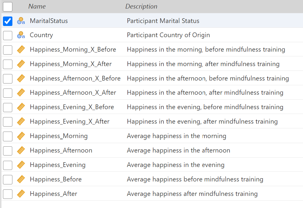
In this data set, "MaritalStatus" and "Country" are two between-subjects variables. The next six variables have the same format. The first word is the dependent variable name. The second word is a level of the first within-subjects variable. The "X" indicates an interaction and is read as "by." The last word is a level of the second within-subjects variable. The third variable represents happiness scores that were collected for subjects during the morning and before a mindfulness training. The last five variables are similar to the previous six, but they represent marginal or mean happiness levels. For example, "Happiness_Morning" contains the mean happiness ratings of individuals in the morning, averaging their ratings from before and after the mindfulness training.
Marginal mean: an average determine by calculating the mean of values across the levels of a variable.
The Data
Your understanding of the structure of the data will be enhanced by peeking at the data stored within each variable. Figure 15 shows a few rows from the data tab.
Figure 15
Data in Example Data Set

You can see "Married" or "Single" listed under the "MaritalStatus" variable. The "Country" variable can be "US", "Canada", or "Mexico." The remainder of the variables contain happiness ratings collected within levels or combinations of levels of the within-subjects variables.
Creating APA-Styled Descriptive Statistics Tables
Let's ask jamovi to calculate a few summaries for our data. We'll want the means and standard deviations as well as a five number summary. To get to the descriptive statistics, click on the "Analyses" tab (see Figure 16).
Figure 16
Analyses Tab

The first option is the "Exploration" menu. Click on that to reveal the available exploration analyses (see Figure 17). We want the first option "Descriptives."
Figure 17
Exploration Menu
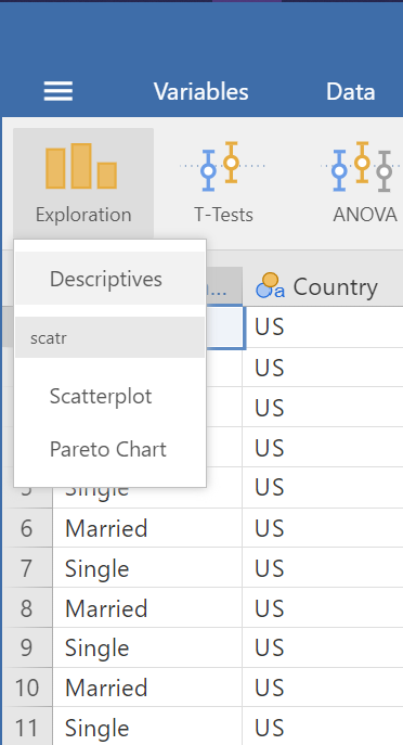
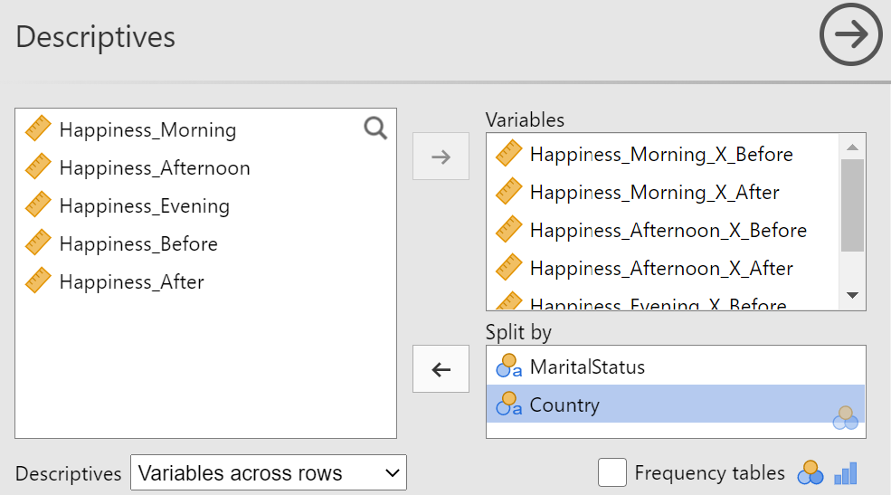
The "Descriptives" panel should now open, with the available variables presented on the left with boxes for the variables to be analyzed and variables to use for grouping or to "split by" (see Figure 18).
Figure 18
Descriptives Panel
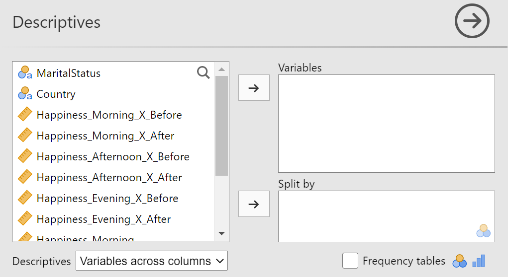
Means and Standard Deviations
We'll want to see the descriptive statistics for each of our sub-samples. By sub-sample, I am referring to a smaller section of the observations, grouped by the levels of the predictor variables. To see our data at the most granular level, we'll need to group the outcome data by the within-subjects variables levels and the between-subjects variables levels. The within-subjects grouping is part of the wide-formatted data set structure and we can use the "Split by" box to group by the between-subjects variables.
Here is how to set up our data to see the lowest-level of grouping:
- Move the two between-subjects variables to the "split by" box. You can do this by selecting each variable (or both by holding the
CTRLbutton on the keyboard while clicking) and dragging to the "split by" box or pressing the right arrow→button next to the "split by box" - The data are aligned with the outcome variable at the interaction of the levels of the within-subjects variables so move the variables with "_ X _" in the name to the "Variables" box.
- Choose "Variables across rows" for the "Descriptives" option below the available variables box. This is slightly for aesthetics, but this will put the calculated statistics across our table, as is convention, rather than down the side.
Figure 19 shows the completed set up. Notice that our marginal variables are the only that have not been included in the set up. You will also likely notice that the "Results" panel on the far right of the application has updated. Each change you make in your analyses will automatically be reflected in the "Results" panel.
Figure 19
Variables Set in Descriptives Panel
With our variables properly aligned, we can tell jamovi which statistics we'd like calculated. Click on the "Statistics" bar that is directly below the variable area in which we've been working. Unlick all the boxes except for "Mean" under "Central Tendency" and "Std. deviation" under "Dispersion" (see Figure 20).
Figure 20
Mean and Standard Deviation Statistic Selection
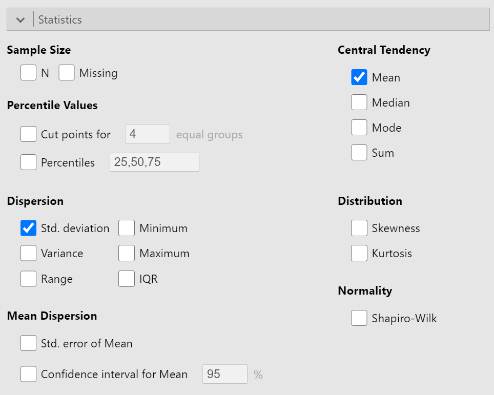
The results section will now display a table that is almost perfectly formatted according to APA guidelines and presents the means and standard deviations for each subgroup (see Figure 21).
Figure 21
Results of Mean and SD calculations
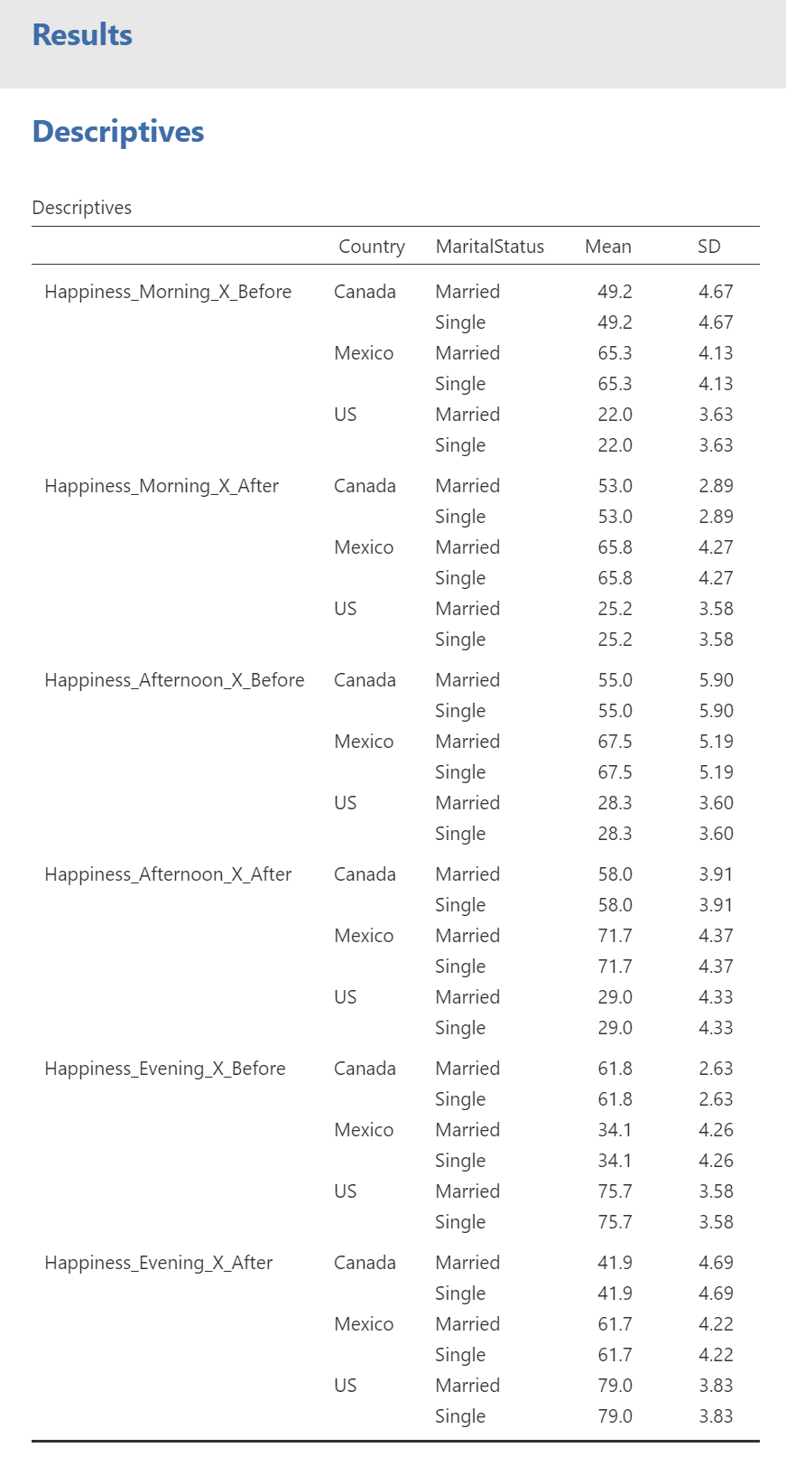
This table is not fully APA-styled because it has an extra row at the top that simply reads "Descriptives." The problem is that "Descriptives" is not a very good title for the table and the table title does not belong as part of the table, but as text above the table. The first column is also missing a label. To rectify these problems, we need to copy the table and paste it into a program that can edit the table. To copy the table, right click on the table and select "Copy" from the context menu (see Figure22).
Figure 22
Copying a Table
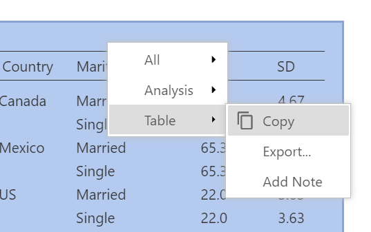
This will store the editable table in the system clipboard until it is pasted into a destination. I'm going to use Microsoft Word but you are welcome to use whatever word processing application you prefer. Open Word and create a new blank document. To paste the table, you can use CTRL + V on the keyboard or use "Home" tab to click the "Paste" button. The table is too long to fit on one page, so Word has divided it up to span two pages (see Figure 23). This is not a problem for our current plan, so we'll focus our efforts in other areas.
Figure 23
Pasted Table in Word
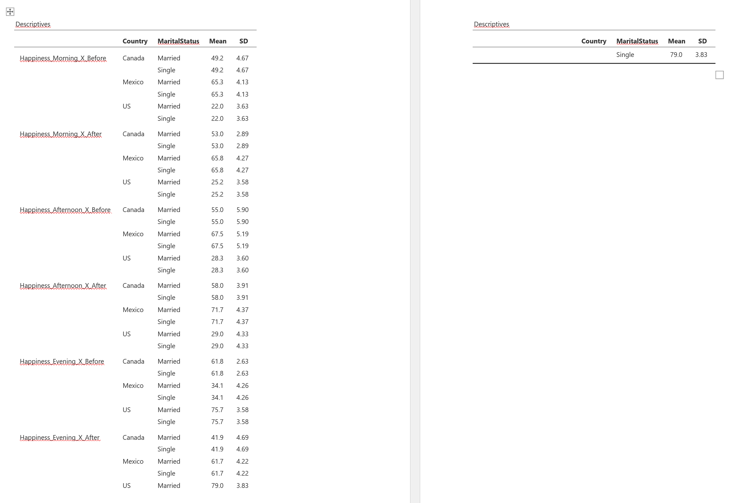
We also can see that "Descriptives" is repeated across the divided table. Let's delete this simply by clicking at the end of "Descriptives " and using the Backspace key until "Descriptives" has been removed completely. Now click in the empty cell to the left of "Country" and type "Time Of Day by Training"
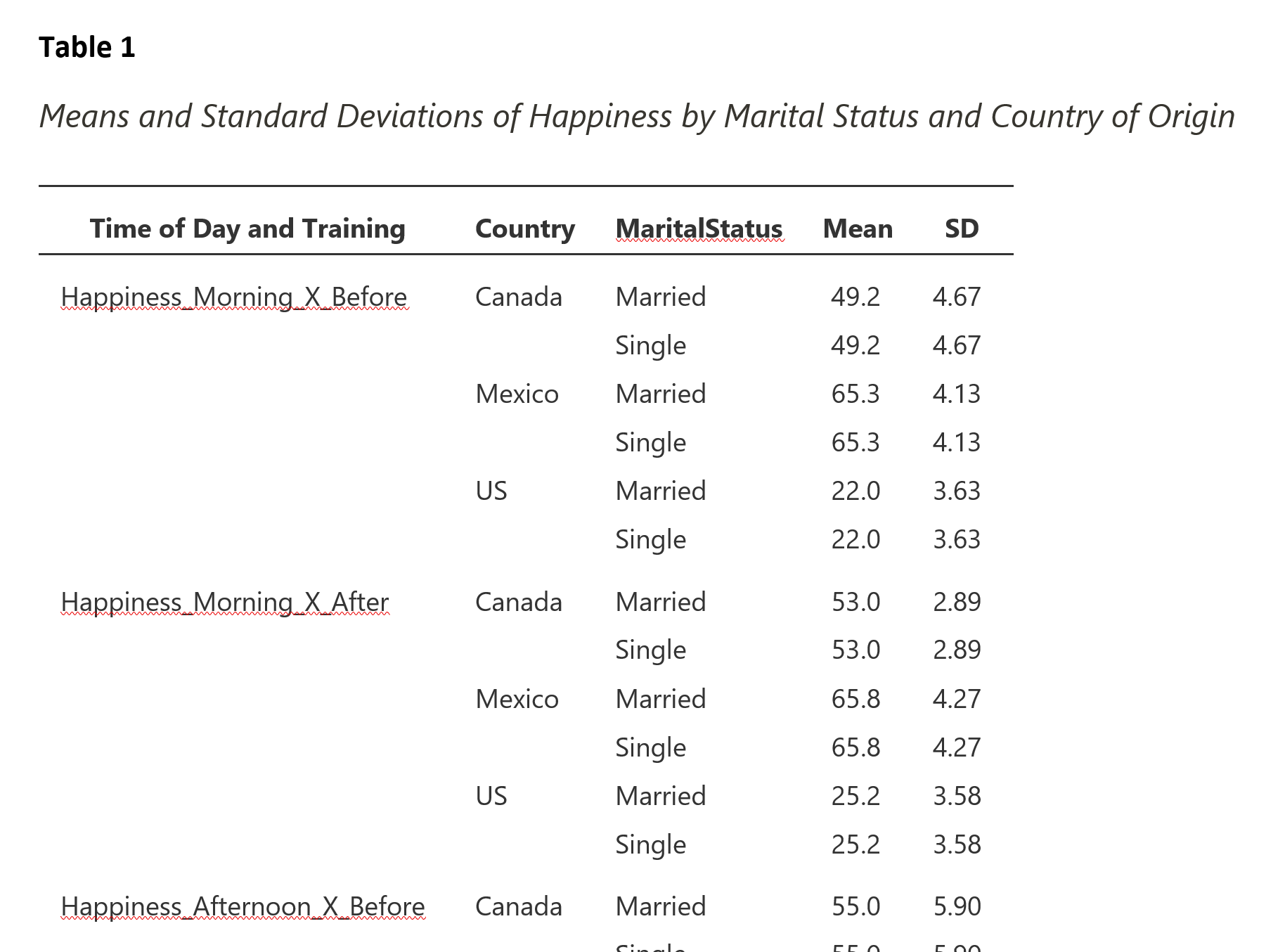
Now that the table itself is ready, we can add the table number and title above the table. Press the Enter key while above the table to create a new line above the table. Type "Table 1" in bold text. Press Enter two more times to create double-spacing. Next, type "Means and Standard Deviations of Happiness by Marital Status and Country of Origin" in italicized text. Figure 24 shows the top portion of the completed table with number and title.
Figure 24
Completed Means and SD Table
Five Number Summary
The means and standard deviation are typical statistics given for normally distributed data. Another useful set of summary statistics that can be helpful for normal and skewed or kurtotic distributions alike is the five number summary. This set of values is so named because one can summarize the shape of the distribution by providing five percentiles: 0 (the minimum), 25 (the first quartile), 50 (the median), 75 (the third quartile), and 100 (the maximum).
Percentile: any number between 0 and 100 that represents the proportion of observations in a distribution that is below that point. For example, in a distribution of IQ (intelligence quotient) scores, the 50th percentile (or median) is 100. That means that 50% of individuals will have an IQ below 100.
To create the five number summaries for our sub-samples in jamovi, we'll want to create a new table. To create a new table (and not add to or edit the mean and SD table we created), click on the "Analyses" tab (if you are not under that tab already), then click on the "Exploration" button and select "Descriptives" from the options (just as we did for the start of the Means and SD table).
Set up the variables in the same way as with the means and SD table with the between-subjects variables being moved to the "Split by" box and the interaction terms containing the outcome variables to the "Variables" box. Lastly, be sure to choose "Variables across rows" at the bottom of the "Descriptives" panel (see Figure 19).
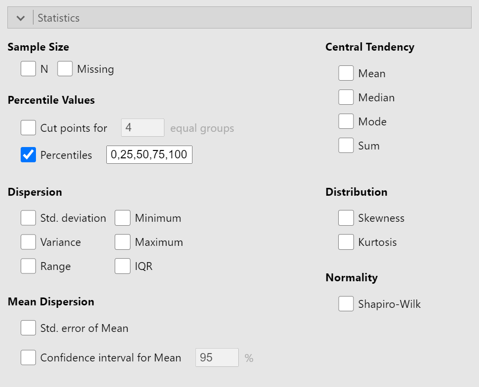
Click on the "Statistics" bar below the variable area to reveal the options of the statistics. Unselect all the boxes and select the box by "Percentiles". In the text box to the right of "Percentiles", type in "0,25,50,75,100" (see Figure 25).
Figure 25
Five Number Summary Selection in Descriptive Statistics Options
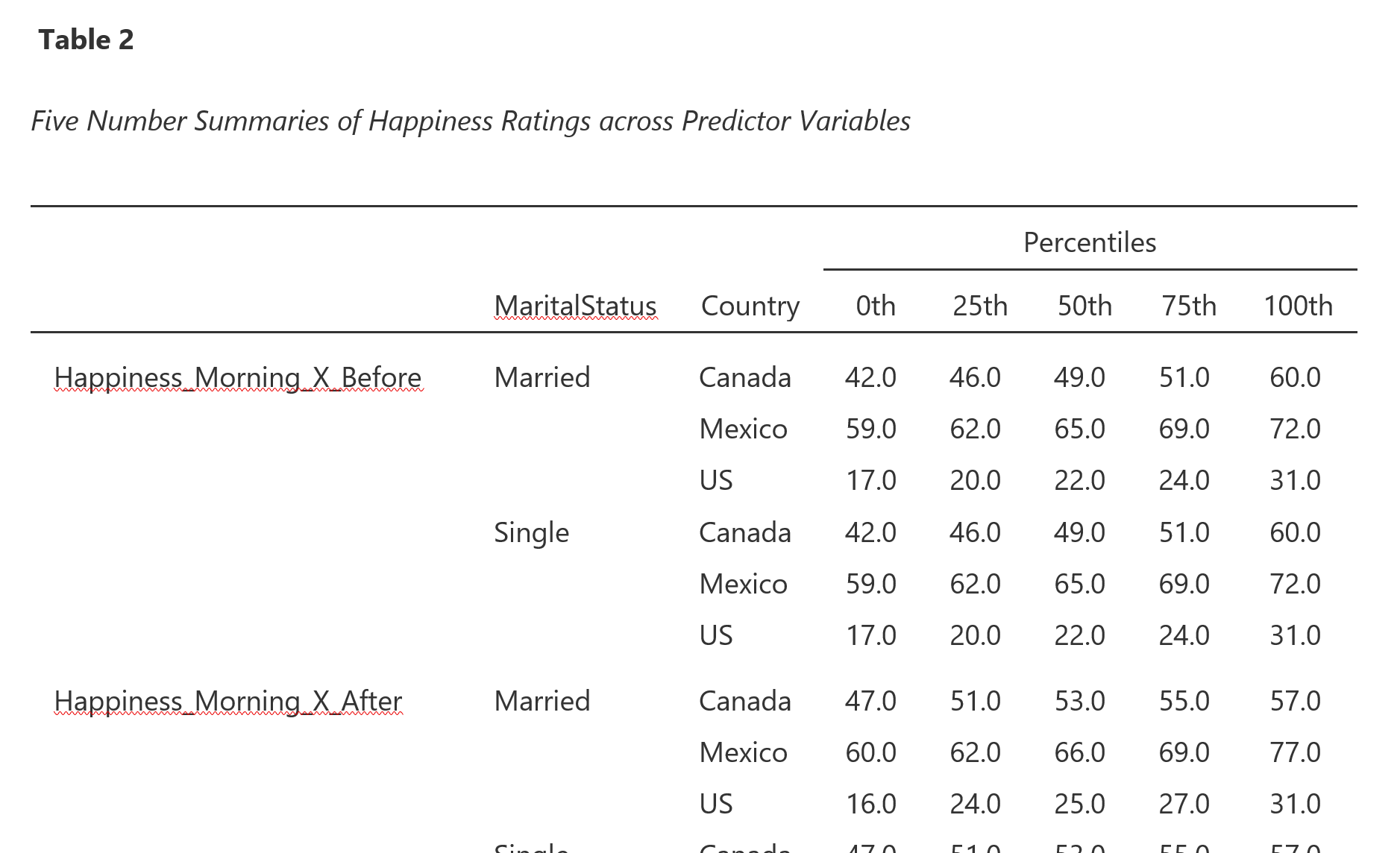
The results panel will automatically update with the table of percentiles. Finish the APA formatting by copying and pasting the table into Word (or other word processor) to delete the word "Descriptives" and to add a table number (in bold) and table title (in italics) above the table. The top portion of the completed table is presented in Figure 26.
Figure 26
Top Portion of Completed Five Number Summary Table
Creating APA-Styled Descriptive Statistics Charts
Charts are powerful tools in data analyses, in part, because the human brain evolved to perceive patterns in visual stimuli. We may be better able to detect deviations from normality of a distribution (an assumption of many of our analyses) by quickly looking at some charts, such as Q-Q plots (where "Q" stands for "quantiles").
Quantiles: the most generic term to encompass the fixed points in a distribution. Common "quantiles" include percentiles (100 points), quintiles (5 points), and quartiles (4 points).
Q-Q plots
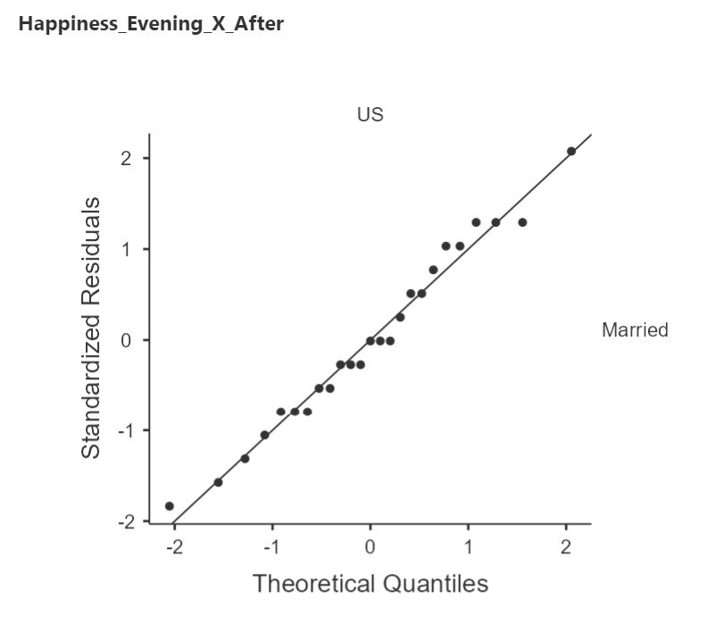
Q-Q plots compare a theoretical distribution to an actual distribution. That is, it compares what we expect to what we observe and calls to our attention any deviations from those expectations. The Q-Q plots produced in jamovi will show us how our errors match against the expectation of a normal distribution. Specifically, these Q-Q plots are comparing how far off each value is from that sample's mean to the theoretical normal distribution. Figure 27 is a Q-Q plot for the sample of happiness ratings in the morning after mindfulness training from Married individuals in the U.S.
Errors: the difference between an observed value and the expected value.
Figure 26
Sample Q-Q Plot
Interpreting Q-Q Plots
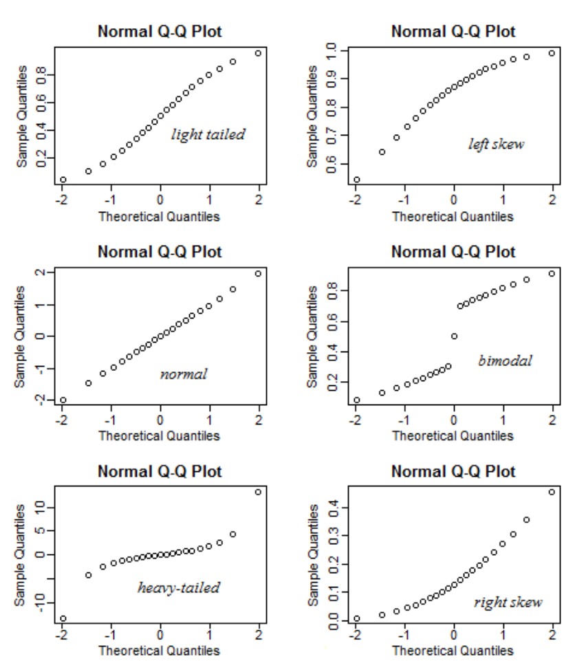
Perfectly normally distributed errors will line up exactly on the reference line (i.e., the solid diagonal line in the Q-Q plot). Essentially, the closer to the reference line, the more normally distributed the errors. Q-Q plots are useful diagnostic plots because the patterns can indicate how the data are distributed. Figure 27 is an excerpt from a Stats - Stack Exchange thread 1
Figure 27
Q-Q Plot Patterns
Arching
Upward. When the points seem to arc upward (top-right panel), the errors are skewed to the left (i.e., tail is longer on the left because of unbalanced extreme valuee on the left side of the distribution).
Downward. When the points are arcing downward (bottom-right panel), the errors are skewed to the right (i.e., unbalanced extreme values on the right side of the distribution).
Snaking
S-shaped. If the points form a flattened s-shape (top-left panel), the errors are "light-tailed". This form of kurtosis (platykurtosis) occurs when there are fewer values in the tails of the distributions than expected for a normal distribution.
Inverted S. If the points climb quickly, level off, then climb quickly again (bottom-left panel), the errors are "heavy-tailed." This form of kurtosis (leptokurtosis) occurs when there are more values in the tails than expected in normal distirbution.
Creating Q-Q plots
Just as we wanted to create our descriptive statistics at the lowest-level of sub-samples, we'll want to create Q-Q plots at this level. Let's create a new set of descriptives by clicking on the "Analyses" tab, then clicking on "Explorations", and then on "Descriptives" in the options.
Set up your variables as we have done previously (split by between-subjects, outcome variable samples in the within-subjects variable levels in the "variables" box; see Figure 19). Turn off all the descriptive statistics selected in the "Statistics" section. Click on the "Plots" bar to expand the options for available plots. Select the "Q-Q" option under "Q-Q Plots" (see Figure 28).
Figure 28
Setting up for Q-Q Plots
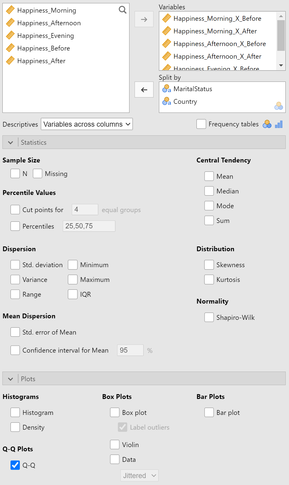
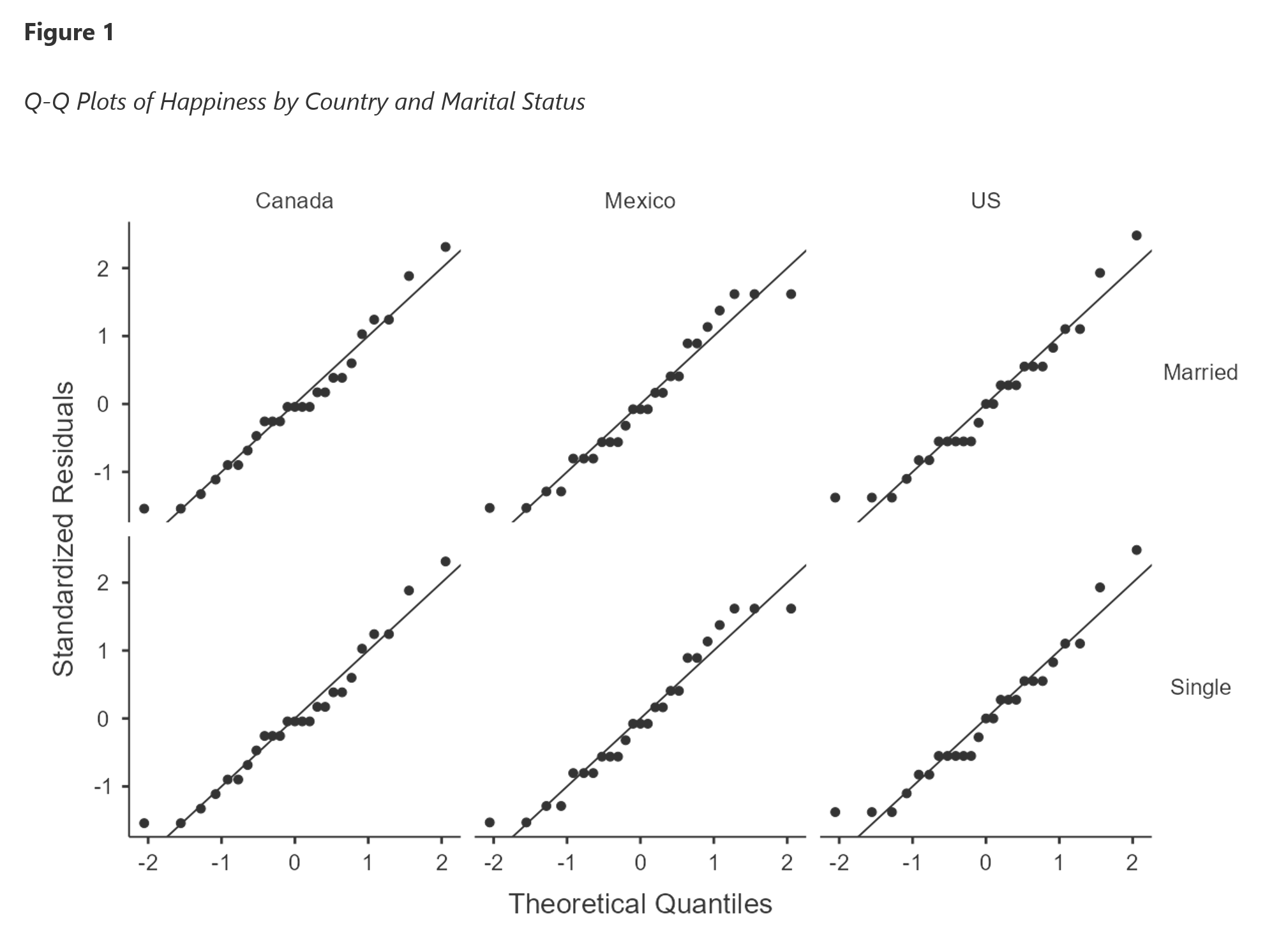
The results section will now contain six plots with six panels, each. That is, for each sample of outcome variable (i.e., the data contained in the interaction of levels of the within-subjects variables), the data are further split by the levels of each between-subjects variable. Figure 29 is the first set of Q-Q plots.
Figure 29
Example Q-Q Plots Panel
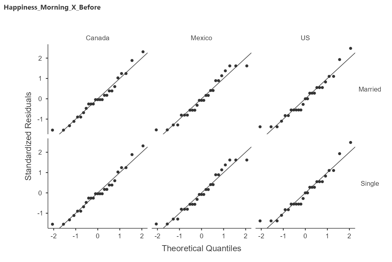
Each of these Q-Q plots represents relatively normally distributed data, as there is little systematic deviation from the reference line. This is a good thing to see given that I created this data set to contain such normal distributions.
There is little work to be done here to get this figure into full APA-style. We need to remove the "Happiness_Morning_X_Before" title and add a proper figure number and figure title. This is even easier than the tables!
Right click on a group of Q-Q plots and select "Copy" under the "Image" option (see Figure 30).
Figure 30
Copying a Plot
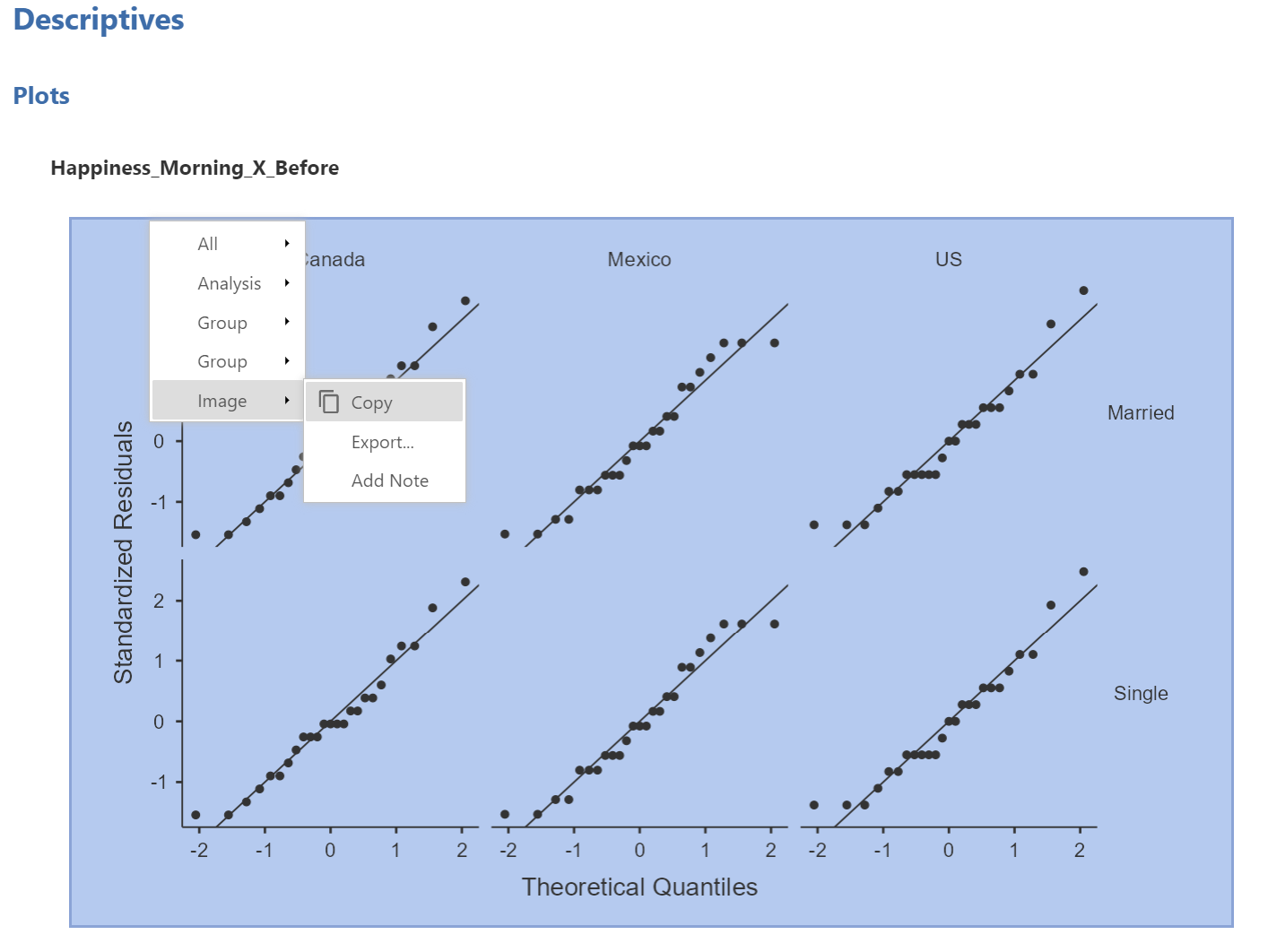
When you paste in Word, you should just see the figure without the title (e.g., "Happiness_Morning_X_Before"). Now we just need to add the figure number (in bold) and the figure title (in italics) to complete the APA-style set-up. Figure 31 shows the completed figure in APA-style.
Figure 31
Completed APA-styled Q-Q Plot Panels
Summary
Descriptive statistics are essential building blocks for the important contribution that statistics makes to science. By describing the data we have, we make it easier to understand the values therein and to make comparisons with other data. As we will soon see, all our estimates about a population or comparisons among populations are based on these summary statistics.
We covered some of the basic summaries for distributions like the mean and median for central tendency and standard deviation and quartiles for dispersion. We also covered some of the basic figures used in assessing data such as histograms, bar charts, and Q-Q plots.
These concepts were presented alongside APA-style guidelines on how to present tables and figures.
