Literacy Link
Location
SVSU
Date
February 2024
Type
Print Magazine
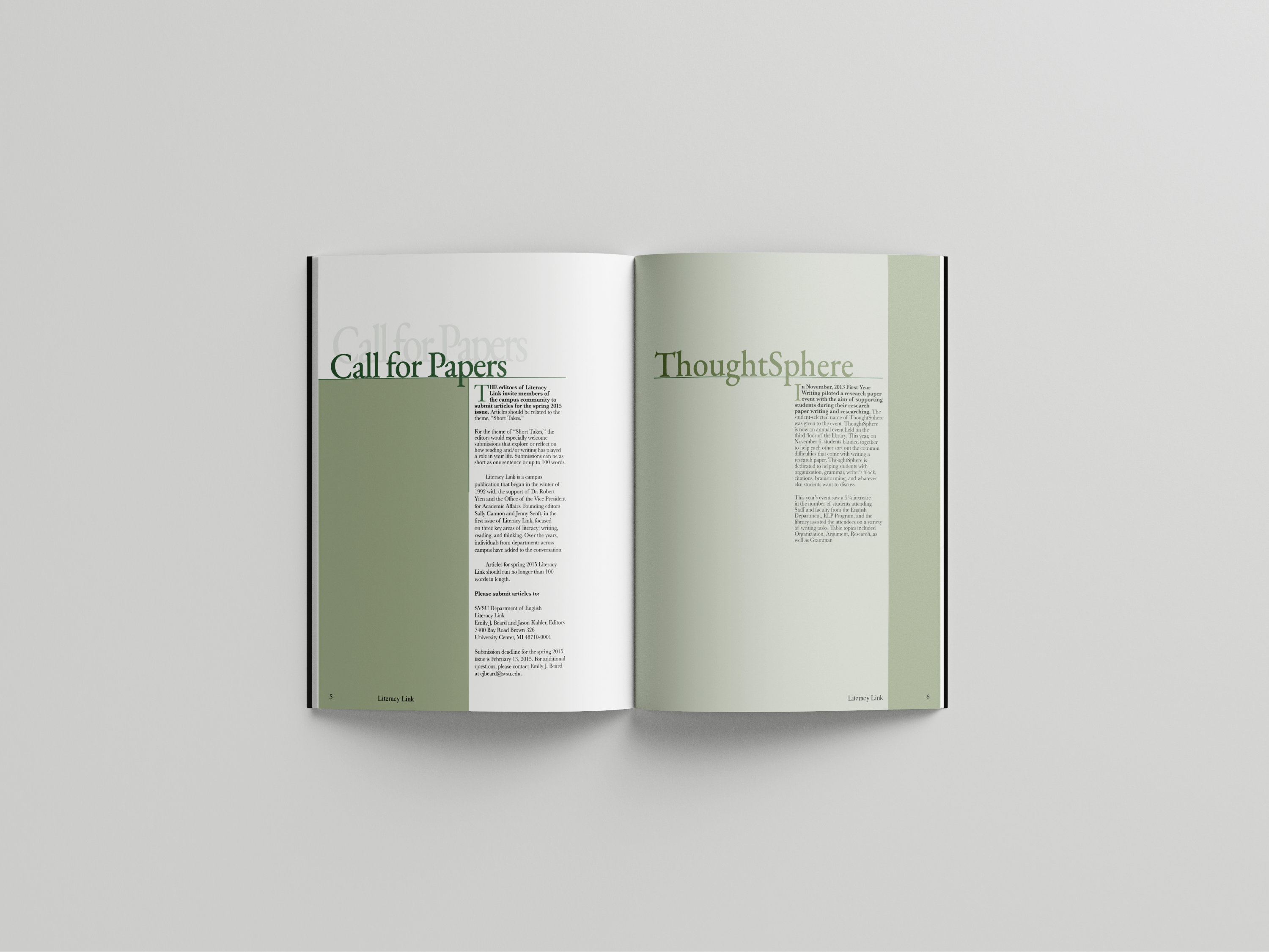
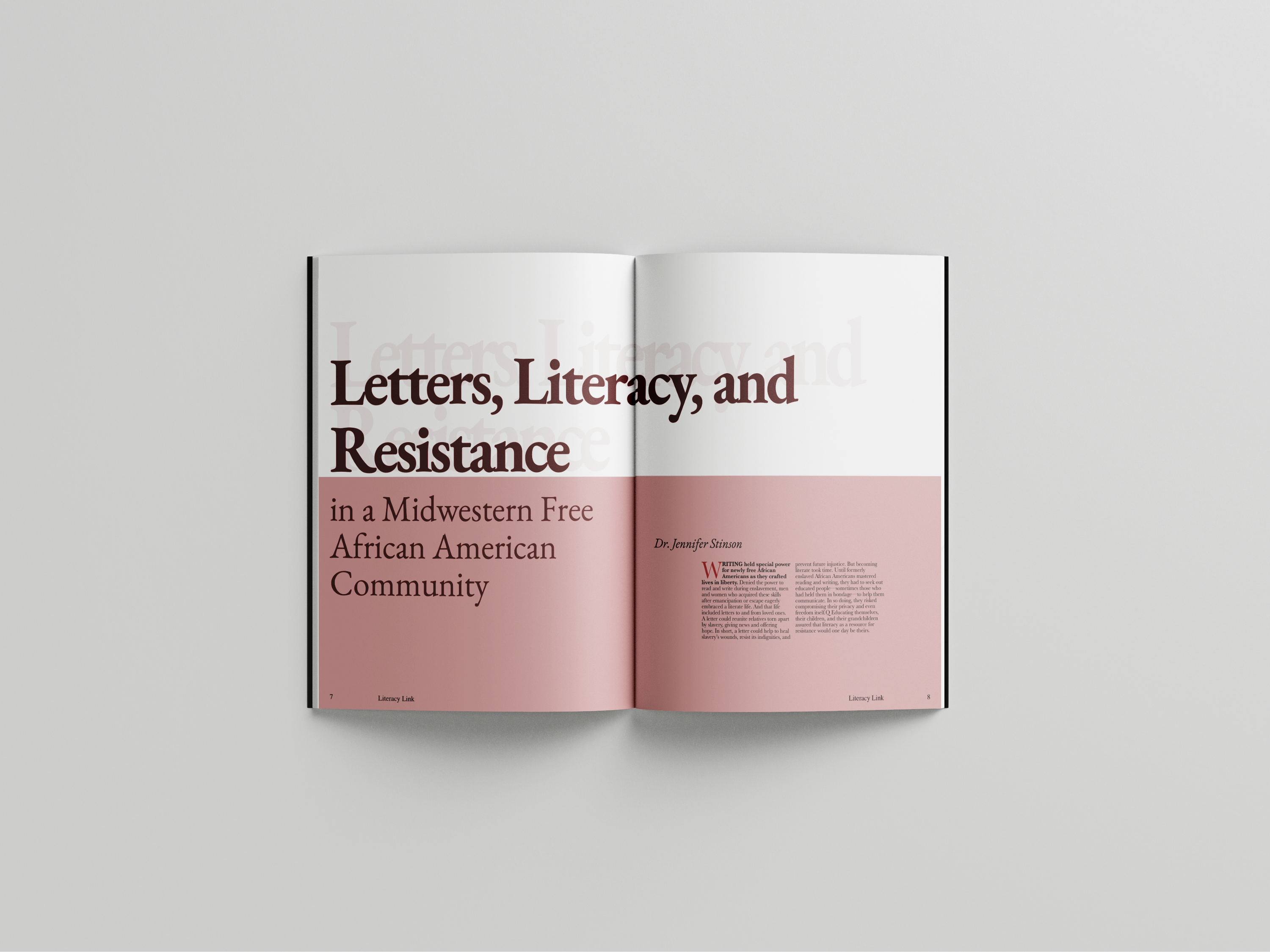
I was tasked with redesigning a previous issue of Literacy Link, a publication that lacked strong typographic structure. My focus was on improving hierarchy and readability to create a more professional, organized layout. The redesign included a new front and back cover built entirely around typography, as well as a clear table of contents to improve navigation. Inside, I structured three distinct types of spreads: one featuring two smaller articles, another with a main article, and a third with a supplementary piece. My design approach emphasized hierarchy—guiding readers to the most important content first while maintaining balance across the spreads. For example, on the two-article spread, I used higher contrast and visual weight on the left-hand article to ensure it was seen first, followed by the secondary piece on the right. This approach allowed the publication to communicate more effectively through typography alone, elevating both clarity and visual impact.